Introduction to Linear modelling in R 2020
- Author: Laura Mackenzie
Preamble
Thank you for choosing this workshop to learn more about Linear Models. When I was constructing the outline of this workshop, I decided to keep it as simple as possible. This course (hopefully) caters to people who are new to statistical analysis using linear models, as well as anyone who just wants to remember what they were taught what feels like a century ago (don’t worry we have all been there!). I want to first give an overview of when we would choose to use linear models, go over the very basics of model assumptions, and then explain what steps we go through to have a robust analysis. Last but not least you will learn to interpret the output from your analysis and make conclusions.
Why are you here?
Well, hopefully, you are here because you have some data and a question you want to answer with that data. But, why choose a linear model to answer our questions? Linear models are extremely versatile and can, when used correctly, be used to answer questions or test hypotheses in many circumstances.
Want to understand if genders differ in height? - a linear model can do that.
Want to understand how apple harvest (in kg) behaves with tree height? - also a linear model
Indeed, a lot of the traditional tests that you may already know (t-test,ANOVA etc.) can actually be performed using a linear model.

Further, linear models are the base to a lot of other models, so understanding them is vital. From there we can then work to extend our model (by altering what we are assuming about our data). Extensions include Linear Mixed Models (LMM), Generalised Linear Models (GLM), Additive Models (GAMs) and much more.
Indeed, the basic principles you are learning here in this workshop, are good practice for all other model types, so even if you already know that you will be using something more complex techniques, this workshop will still be useful for you.
Before we begin: What is my data type?
While linear models are incredibly versatile, there are a few things we have to consider before fitting a linear model. Linear models are specific to certain data types.
If these words make you nervous - fear not we will go through what it means.
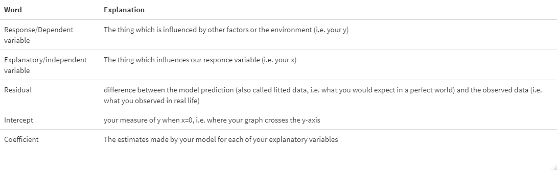
Data can come in many shapes and sizes. To know which model type to fit we need to know what type of data the response variable is. Here is a table of data types that you may encounter, some examples and what type of model is appropriate:
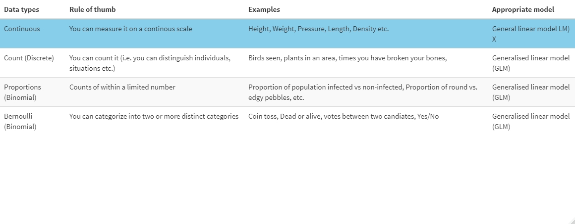
X: There are some exceptions where a LM would not be used for continous data e.g. if the data is strictly positive we may have to use other models.
You should know what type of data your response variable is because you collected it. If you are not sure, think about what it is that you are looking at. Is it something on a spectrum or a sliding scale - most likely continuous. Is it something you can count - it’s counts data. You can usually work it out quite easily what your response is by looking at the data in the data frame.
Now, to fit a linear model our response variable has to be continuous.
Before we begin: Assumptions of linear models
Further, to make any robust conclusions from our linear model there are a few assumptions that we make when fitting a linear model, which we need to keep in mind throughout. These include:
1. Normality of residuals:
People often get this wrong. We are not assuming that our collected data is normally distributed but that the measurements are normally distributed around the fitted model.This is why we check if our residuals are normally distributed. Residuals are the difference between data calculated from the fitted model and the data that you collected. These residuals need to be normally distributed.
If none of this makes sense to you, fear not we will go over how to check this assumption further on, once we have fitted the model.
2. Homogeneity of variance/homoscedacity
Our residuals have equal variance. This means that our residuals do not increase or decrease with x. If this is the case it is likely that we have not included a variable which is inherent in our system which we need to make better predictions. For a really good walkthrough hmoscedacity and heteroscedacity have a look at this tutorial.
3. Assumption of Independence:
This means that the value of our response variable for one observation does not influence the response of another observation. This should really be accounted for during the experiment.
An example of non-independence would be that if we measured plant height of 10 plants which are split into two pots, the height of the plants in the same pot is not independent.
However, when we fit models we can account for some of the non-independence (i.e. by taking the variable “pot ID” into account). So to test for independence we again need to fit the model and then look for any patterns in the residuals.
If we do see a pattern this could mean that:
- We have not included all the explanatory variables which account for any non-independence, or
- That we are trying to fit a unsuitable model, e.g trying to fit a straight line to a curved relationship
4. Our explanatory variables are not correlated/collinear
If our variables are correlated and we fit them in the same model this can lead to some variables becoming non-significant, even though a relationship between response and explanatory variable is present. So we should not fit explanatory variables, which are correlated, in the same model. (However, see Freckleton (2011) for a discussion of this). To understand this a bit better have a look at this video
For anyone who wants to have a whole video on the assumptions of linear models/regressions have a look here
The fun bit
Now I have talked enough about assumptions and model types, we will play with some data. To follow this workthrough, download the data linked here and upload it to your R session.
```{r, Load data}
Data<-read.csv("Hangryness_trial.csv")
```
This is data stems from a very “scientific” trial I conducted, called “The Hangryness trial”.
Here, I measured hangryness of my flatmate at different time intervals since the last bit of food was consumed. I also collected data on how much chocolate my flatmate had eaten during breakfast and categorised this into three levels: no chocolate consumed, some chocolate consumed and all the chocolate consumed. Lastly, I measured my flatmates bloodsugar levels the same time I measured hangryness.
To get an overview of the data set let’s explore it a little:
```{r explore data}
str(Data)
``` ``` 'data.frame':	3000 obs. of  5 variables:  $ X          : int  1 2 3 4 5 6 7 8 9 10 ...  $ hangryness : num  2.83 6.53 4.94 9.22 8.65 3.5 8.1 2 3.66 1.81 ...  $ choc_day   : chr  "all the choc" "all the choc" "all the choc" "all the choc" ...  $ time       : num  1.3 3.9 3.3 5.3 5.5 1.7 4.8 0.8 2.6 0.7 ...  $ Blood_sugar: num  123.2 109.9 108.2 100.5 98.3 ...  ```
As you can see, we have hangryness, time and bloodsugar as numeric, continuous variables while R recognises “choc_day”as a character string. However, we want choc_day to be a factor, otherwise R will come up with problems when you try and fit the model. So let’s change that:
```{r change choc_day}
Data$choc_day<-as.factor(Data$choc_day)
is.factor(Data$choc_day)
```
Step 1 Create a hypothesis:
First, as a good scientist you need to create a hypothesis, i.e. what you expect should happen, before you fit a model. This is so we do not just randomly fit models without having a good idea what the data SHOULD tell us, and what is a sensible conclusion.
Here, my hypotheses are as follows:
- Hangryness increases with increasing time since my flatmate last ate.
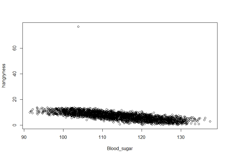
- Hangryness decreases with increasing blood sugar.
- Baseline hangryness is higher on days that my flatmate ate no or only some chocolate.
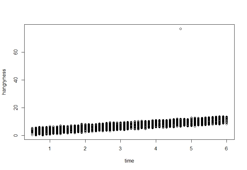
To check if we have any grounds on these hypotheses you can plot out the data to check visually.
(I will keep this plotting very simple to accomodate all learning stages. If you are more advanced in R please feel free to do more.)
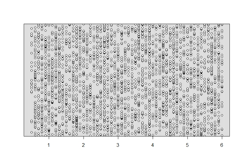
```{r, Hangryness~time}
plot(hangryness~time, data=Data)
```
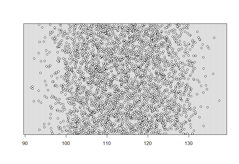
```{r, Hangryness~Bloodsugar}
plot(hangryness~Blood_sugar, data=Data)
```
```{r}
boxplot(hangryness~choc_day, data=Data)
```
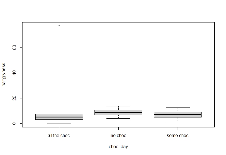
It seems our hypothesis may be correct but there is an annoying value which keeps getting in the way.
Step 2 Check for outliers
Before we fit a model it is always good to have a visual overview of the data. During data entry it is always possible that we typed in the wrong number, or missed a decimal point. This can lead to problems when it comes to interpreting our model. From our previous plots we can already see that this may be the case.
To get an idea if we have any outliers we can use several functions:
```{r,eval=FALSE}
boxplot()
dotchart()
```
Zuur et al. suggets using Cleveland dot plots for continous or count data, so we will follow suit. Cleveland dotplots plot data values on the x-axis against the row number that data point is found in on the y-axis. So while there may be clar patterns overall, what we do not want to see is one or some data points which are very isolated on the x- axis. Let’s plot each variable to see what we get:
```{r , dotchart_time}
dotchart(Data$time)
```
This seems senisble with a nice spread in the data but no data point is very isolated on the x-axis. You can see that data was collected between around 0-6 hours since the last meal.
```{r, dotchart_bloodsugar}
dotchart(Data$Blood_sugar)
```
Again, a nice spread and not one data point which looks isolated on the X-axis.
```{r, dotchart_Hangryness}
dotchart(Data$hangryness)
```
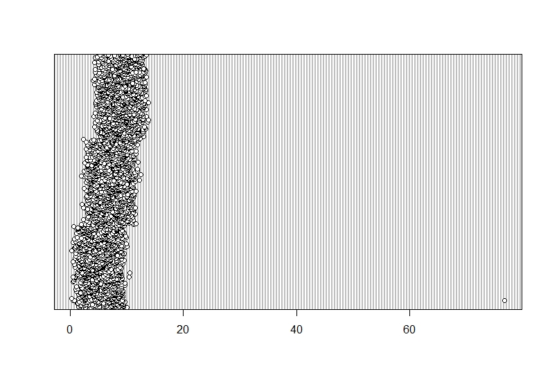
This is weird. One of the data points does not fit into the general picture. This seems to be an outlier.
There are several ways of dealing with an outlier:
- if you think it is a typo you can try and amend the error.
- if you think this is a typo you can delete the observation
- if you think it is just natural variation but a true observation you can leave it as it is and hope for the best that your model still works
- if there are one or several ovservations which are a lot higher or lower than the bulk of the data you may have to use a datta transformation to make them more similar (e.g. take the log())
But remember: You always have to have extremely strong justifications for removing outliers, otherwise data fraud is possible. Also, always note down if you remove outliers to make this clear to reviewers etc.
I believe this is a typo so I will move the decimal point.
```{r, amend typo}
Data$hangryness<-ifelse(Data$hangryness>20,Data$hangryness/10,Data$hangryness)
# "if hangryness is larger than 20, divide the value by 10 (i.e. move the decimal point), and if not just leave the data as is".
``` Lets see if this worked.

```{r, dotchart_Hangryness2}
dotchart(Data$hangryness)
```
And indeed this seems to have altered the outlier. Be aware though that altering or removing outliers routinely may have a big effect on the outcome.
Step 3 Check for correlations
As mentioned previously we want to check if we have any correlations in our explanatory variables, so they don’t interfere with each other. To check this we can use several approaches. There is a pre-written function on R which calculates correlation scores for all your variables using Pearson correlation and plots them out. Copy this function and run it:
```{r,panel.cor function, error=FALSE}
panel.cor <- function(x, y, digits = 2, prefix = "", cex.cor, ...)
{
  usr <- par("usr"); on.exit(par(usr))
  par(usr = c(0, 1, 0, 1))
  r <- abs(cor(x, y))
  txt <- format(c(r, 0.123456789), digits = digits)[1]
  txt <- paste0(prefix, txt)
  if(missing(cex.cor)) cex.cor <- 0.8/strwidth(txt)
  text(0.5, 0.5, txt, cex = cex.cor * r)
}
```

```{r,pairs_plot}
pairs(Data[,c(2,4:5)], lower.panel = panel.smooth, upper.panel = panel.cor)
# this will create a correlation plot for the continuous variables (you do not explude the 1 and 3rd column you get a warning message)
```
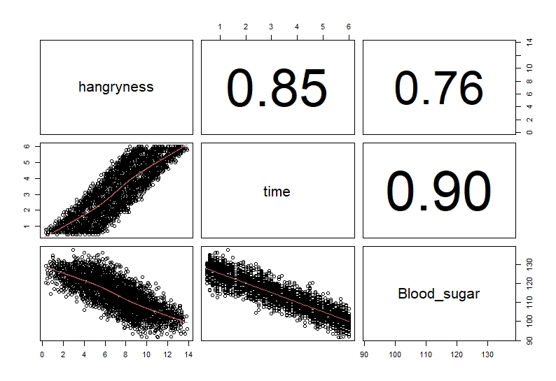
Usually, we classify anything over 0.6 to be correlated (remember these are not end all and be all values but are cutoffs most people use). As you can see time and bloodsugar are highly correlated (correlation value = 0.9).
We could also just run a test:
```{r, Pearson cor}
cor.test(Data$time,Data$Blood_sugar, method="pearson")
```
    	Pearson's product-moment correlation

data:  Data$time and Data$Blood_sugar
t = -111.97, df = 2998, p-value < 2.2e-16
alternative hypothesis: true correlation is not equal to 0
95 percent confidence interval:
    -0.9050402 -0.8912147
sample estimates:
       cor
-0.8983497
These tests show that time and bloodsugar levels are highly correlated. Therefore, we will not include them together in the model to avoid any problems in interpretation.
Other tests which can be run are spearmans rho, which is less sensitive than the pearsons correlation test. These test correlate two variables at a time. Some people suggest using correlation tests which correlate multiple variables at a time, such as the variance inflation facctor (VIF). For discussion of these see this tutorial
Step 4 Fitting the model, choosing a model and interpreting the basic outcomes
Now that we have looked at the data, have a hypothesis and checked for correlation, we will finally find out what makes my flatmate hangry!
There are several ways of fitting and selecting models.
- You can fit a full model and then drop any variables which are not significant one by one starting with interactions.
- You can fit variables one after the other and compare which describes the data best. Make sure to keep variables which may influence non-independence.
- Use a hypothesis testing approach and only fit models which are predetermined by your hypotheses.
For a full discussion see: Zuur et al. (2009)
We will go by fitting a full model without the two correlated variables and then dropping non-significant variables one-by-one:
```{r, model 1}
model1<-lm(hangryness~time*choc_day,data=Data, na.action=na.omit) #Here I am fitting a model which investigates the effect of time and choc-day on hangryness as well as an interaction between the two
```

```{r,summary, eval=FALSE}
summary(model1) #to be able to read the model output we need to call summary
```
Call:
lm(formula = hangryness ~ time * choc_day, data = Data, na.action = na.omit)

Residuals:
     Min       1Q   Median       3Q      Max
-1.56735 -0.33845  0.00017  0.34278  1.81605

Coefficients:
                         Estimate Std. Error t value Pr(>|t|)
(Intercept)             0.4932033  0.0352044  14.010   <2e-16 ***
time                    1.5069050  0.0098007 153.755   <2e-16 ***
choc_dayno choc         3.4919161  0.0508976  68.607   <2e-16 ***
choc_daysome choc       1.7983044  0.0499704  35.987   <2e-16 ***
time:choc_dayno choc    0.0028626  0.0140901   0.203    0.839
time:choc_daysome choc -0.0001457  0.0138633  -0.011    0.992
---
Signif. codes:  0 ‘***’ 0.001 ‘**’ 0.01 ‘*’ 0.05 ‘.’ 0.1 ‘ ’ 1

Residual standard error: 0.5019 on 2994 degrees of freedom
Multiple R-squared:  0.9695,	Adjusted R-squared:  0.9695
F-statistic: 1.906e+04 on 5 and 2994 DF,  p-value: < 2.2e-16
So how do we interpret the output??

This picture gives a rough over view of our output but how do we interpret it. Let’s start with the intercept: On days where my flatmate has eaten “all the choc” they have a hangryness level of 0.49 at time=0. On days where they have eaten some chocolate their hangryness level is at 2 (i.e. 0.49 + 1.50=~2 ) at time=0 and on days where no chocolate was consumed this is even higher with ~ 4 points (0.49+3.49 = 3.98) on the hangryness scale at time=0. We can also see that with every 1 increase in time (i.e. ever hour) the hangryness scale goes up by approximately 1.5 points. We call this the slope. And lastly on days where no chocolate was eaten this slope is a little steeper with 0.002 more points per hour, and flatter on days where some chocolate was eaten.
However, does it seem like all variables are usefull in describing our relationship and should be retained in the model? To test this, we can either look at the p-value or use other means of testing such as AIC, BIC etc. Here, I am going to use drop1 which gives me the AIC of models where each variable was dropped one by one. We will consider any variable with an increase in AIC of less than 2 in comparison to the original model as “non-singificant”. You could also have a look at the Pr(>Chi) which can be interpreted similarly to our p-value.
```{r, model1 drop1, tidy=TRUE}
drop1(model1,test="Chi")
# this gives you an overview if variables are significant. this is done by comparing models with all variables in the model and dropping each variable individually from the model. The Pr(>Chi) can be interpreted similar to the p-value. For AIC a conservative estimate is that if the AIC increases by more than 2 when a variable is dropped this variable explains some of the variation
```
Single term deletions

Model:
hangryness ~ time * choc_day
              Df Sum of Sq    RSS     AIC Pr(>Chi)
<none>                     754.34 -4129.6
time:choc_day  2   0.01445 754.35 -4133.5   0.9717
As we can see time*choc_day does not seem to be significant/ does not explain any of our data (difference in AIC before and after dropping the variable ~0.01), so can be dropped. This means that no matter how much chocolate was consumed each morning, the rate at which hangryness increases with time is the same.
Let’s fit a model without the interaction and see what happens:
```{r, model2}
model2<-lm(hangryness~time+choc_day,data=Data, na.action=na.omit) #Here I am fitting a model which investigates the effect of time and choc-day on hangryness separately
summary(model2)
```
Call:
lm(formula = hangryness ~ time + choc_day, data = Data, na.action = na.omit)

Residuals:
     Min       1Q   Median       3Q      Max
-1.56730 -0.34012  0.00007  0.34180  1.81447

Coefficients:
                  Estimate Std. Error t value Pr(>|t|)
(Intercept)       0.490433   0.024245   20.23   <2e-16 ***
time              1.507769   0.005717  263.71   <2e-16 ***
choc_dayno choc   3.501232   0.022444  156.00   <2e-16 ***
choc_daysome choc 1.797809   0.022441   80.11   <2e-16 ***
---
Signif. codes:  0 ‘***’ 0.001 ‘**’ 0.01 ‘*’ 0.05 ‘.’ 0.1 ‘ ’ 1

Residual standard error: 0.5018 on 2996 degrees of freedom
Multiple R-squared:  0.9695,	Adjusted R-squared:  0.9695
F-statistic: 3.179e+04 on 3 and 2996 DF,  p-value: < 2.2e-16
Looking at how we interpreted the output above, what would you conclude from this output?
```{r}
drop1(model2, test="Chi")
```
Model:
hangryness ~ time + choc_day
         Df Sum of Sq     RSS     AIC  Pr(>Chi)
<none>                  754.4 -4133.5
time      1   17510.2 18264.5  5425.0 < 2.2e-16 ***
choc_day  2    6128.9  6883.3  2495.4 < 2.2e-16 ***
---
Signif. codes:  0 ‘***’ 0.001 ‘**’ 0.01 ‘*’ 0.05 ‘.’ 0.1 ‘ ’ 1
Should we keep both time and choc-day in the model? Answer: (both time and choc_day increase the AIC massively (deltaAIC>6000) and have a highly significant p-value)
Let’s fit the same model but with bloodsugar instead of time:
```{r, model3}
model3<-lm(hangryness~Blood_sugar+choc_day,data=Data, na.action=na.omit) #Here I am fitting a model which investigates the effect of time and choc-day on hangryness separately
summary(model3)
```
Call:
lm(formula = hangryness ~ Blood_sugar + choc_day, data = Data,
    na.action = na.omit)

Residuals:
    Min      1Q  Median      3Q     Max
-4.6460 -0.7912  0.0364  0.7967  4.4203

Coefficients:
                   Estimate Std. Error t value Pr(>|t|)
(Intercept)       33.083859   0.277584  119.19   <2e-16 ***
Blood_sugar       -0.243432   0.002412 -100.92   <2e-16 ***
choc_dayno choc    3.524848   0.052652   66.95   <2e-16 ***
choc_daysome choc  1.831732   0.052646   34.79   <2e-16 ***
---
Signif. codes:  0 ‘***’ 0.001 ‘**’ 0.01 ‘*’ 0.05 ‘.’ 0.1 ‘ ’ 1

Residual standard error: 1.177 on 2996 degrees of freedom
Multiple R-squared:  0.8323,	Adjusted R-squared:  0.8322
F-statistic:  4958 on 3 and 2996 DF,  p-value: < 2.2e-16
Here, the interpretation follows the same steps but we need to rethink a little. From the intercept we can see that if bloodsugar was at 0 we would have a hangryness scale of 33. This is obviously non-sensical as your bloodsugar can’t drop to 0 without SERIOUS consequences. Days on which no chocolate was consumed the hangryness scale is 3.5 points higher. Also we can see that instead of having a positive relationship with increasing bloodsugar hangryness decreases.
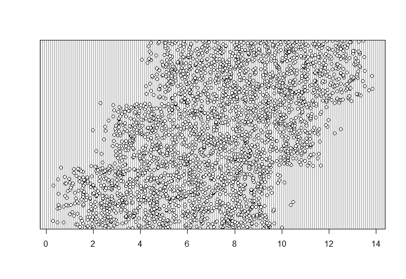
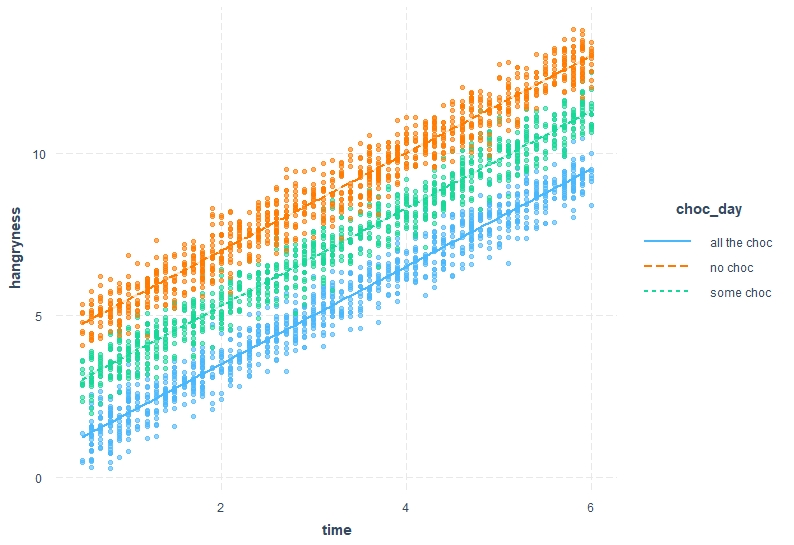
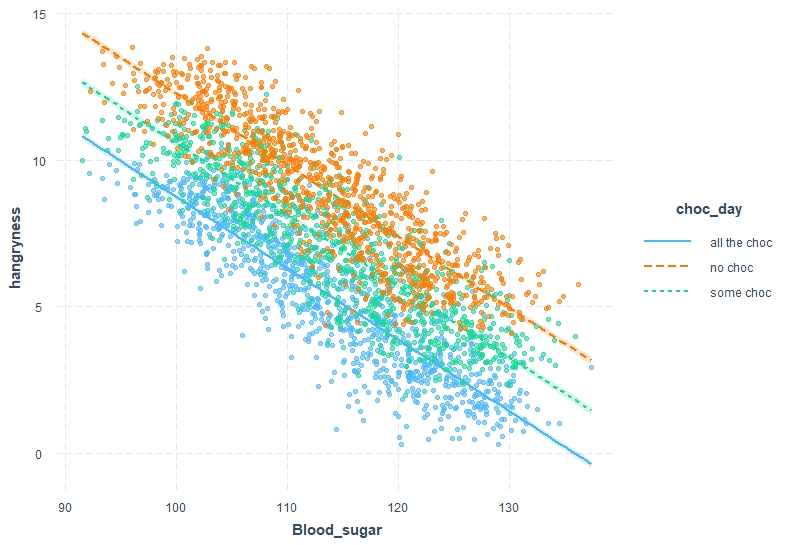
Let’s plot these interpretations out . This time I will use a fancier package called “interactions” to make results clearer, but a similar plot can be achieved with more basic functions (also, if you are more familiar with ggplot() have a look at ggeffects())
```{r,ggplot_time, warning=FALSE }
library(interactions)
interact_plot(model2, pred = time, modx = choc_day, interval = TRUE, plot.points = T)
```
```{r,ggplot_bloodsugar, warning=FALSE}
interact_plot(model3, pred = Blood_sugar, modx = choc_day, interval = TRUE, plot.points = T)
```
Step 5 Model validation
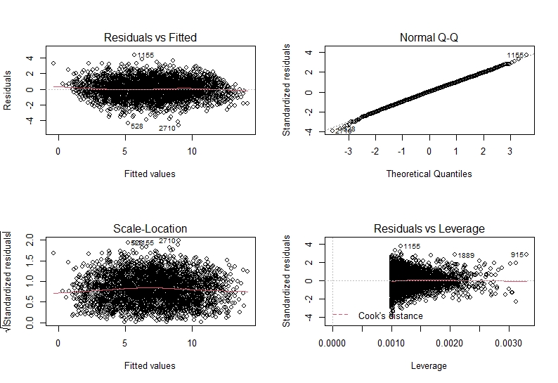
If you cast your mind back to the beginning of the workshop we discussed a few assumptions that we make of the data to be able to extrapolate our results. This is now the point at which we need to check that our data follows these assumptions. Thankfully there is a very handy plot which makes this easy.
```{r, plot model2 output}
par(mfrow = c(2,2))
plot(model2)
```
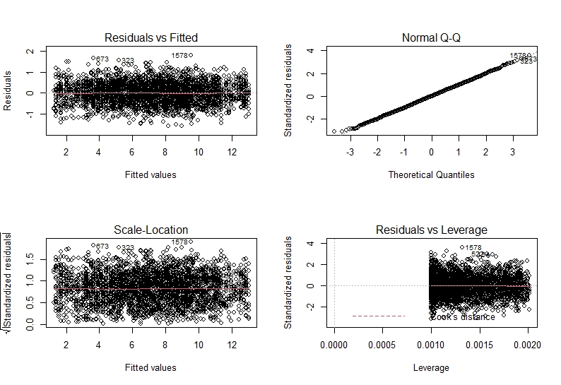
Let’s breakdown what we see and how to interpret this. The two plots on the left plot residual vs our fitted values and standardised residuals vs fitted values. This tests the assumption of independence and homogeneity of variance. From both of these we want to see something similar to a “starry night”. This means we do not want to see a pattern in the data (such as a slope or anything) and we want to see roughly equal points either sides of the horizontal line.
The top right plot shows us a QQ-plot of the residuals. This is how we assess if our residuals are normally distributed. we want to see a more or less straight line along the dotted diagonal line. Any strong patterns may show us that the residuals are not normally distributed and we need to fit a different kind of model type.
Lastly, on the lower right hand side we have a plot of residuals vs their leverage. This is how we test if there are any observations which massively affect our model (i.e. do we have outliers which mess with our model output). Here, data points with undue influence will be highlighted. Any points with a leverage of >0.5 will be considered problematic.
As you can see, there seems to be no problems in our residuals in model2.
```{r, model 3 output}
par(mfrow = c(2,2))
plot(model3)
```
Similarly, model3 also seems to be fine. This means that we can make inferences from our models (see model interpretation) with confidence!
Step 6 Now it’s your turn
Now that you know how to check your data, fit a model, interpret the output and validate that our assumptions have been met, it is your turn to explore a little.
-
Fit a model without including choc_day as a variable. How do you interpret the validation output? How does the R-squared compare to our other model? What do you think about the assumption validation? Why do you think that is?
-
Fit a model without changing anything about the outlier? What happens to your model validation?
-
Fit a model with both time and bloodsugar in the model. What happens to your estimates? Why do you think that is?
Glossary
References
- Zuur, A.F., Ieno E.N, Walker N.J, Saveliev, A.A., Smith, G.M. 2009 “Mixed Effectss Models and Extensions in Ecology with R”, Springer
- Freckleton, R. P. (2011) ‘Dealing with collinearity in behavioural and ecological data: model averaging and the problems of measurement error’, Behavioural Ecology and Sociobiology, 65, pp. 91–101. doi: 10.1007/s00265-010-1045-6.