Quantifying population and visualising species occurrence change tutorial
Tutorial Aims:
1. Formatting and tidying data using tidyr
2. Efficiently manipulating data using dplyr
3. Automating data manipulation using lapply(), loops and pipes
4. Automating data visualisation using ggplot2 and dplyr
5. Species occurrence maps based on GBIF and Flickr data
Quantifying population change
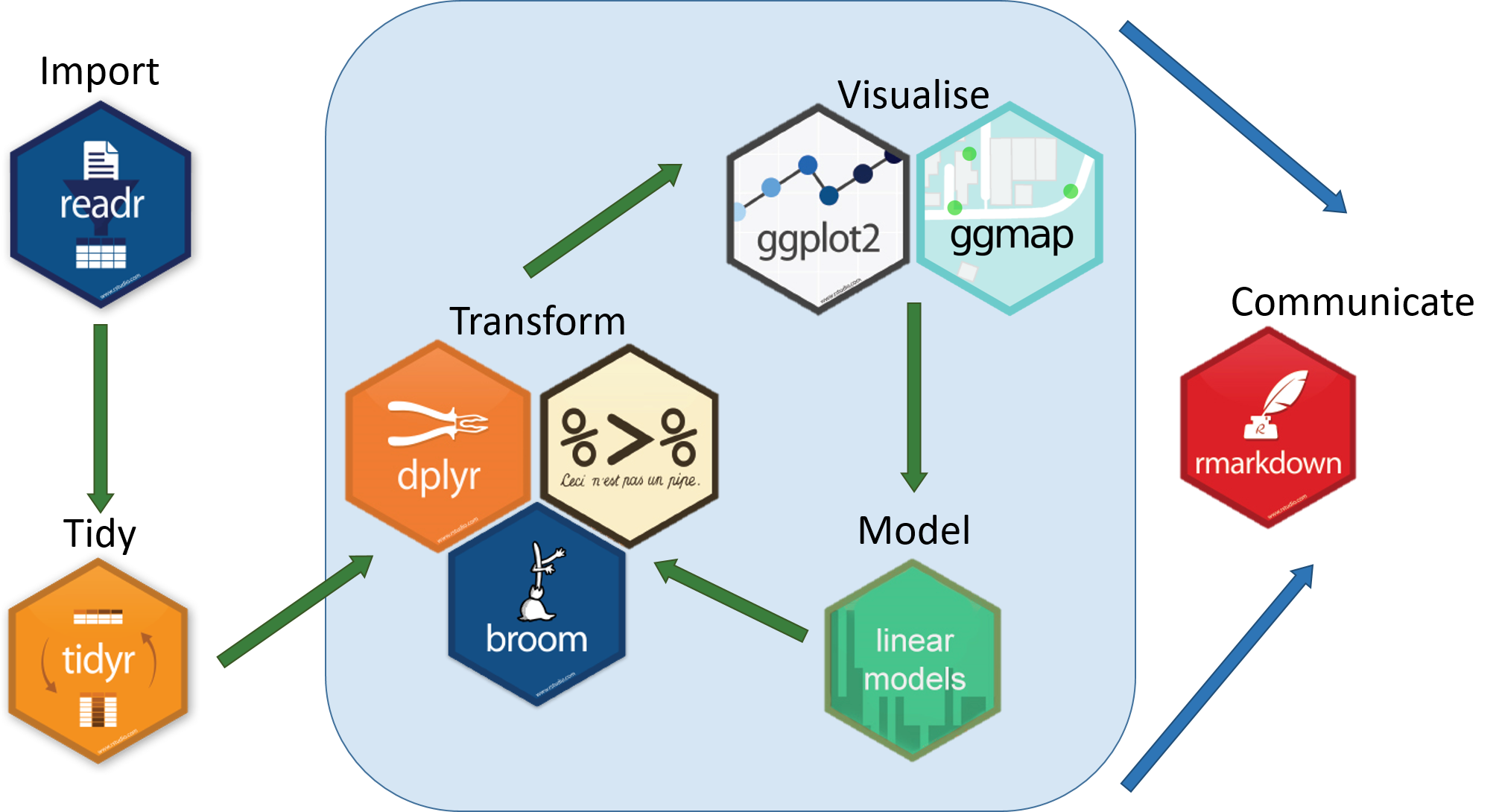
This workshop will provide an overview of methods used to investigate an ecological research question using a big(ish) dataset that charts the population trends of ~15,000 animal populations from ~3500 species across the world, provided by the Living Planet Index. We will use the LPI dataset to first examine how biodiversity has changed since 1970, both globally and at the biome scale, and then we will zoom in further to create a map of the distribution of the Atlantic puffin based on occurrence data from GBIF and Flickr. We will be following a generic workflow that is applicable to most scientific endeavours, at least in the life sciences. This workflow can be summed up in this neat diagram we recreated from Hadley Wickham’s book R for Data Science:
All the resources for this tutorial, including some helpful cheatsheets can be downloaded from this repository Clone and download the repo as a zipfile, then unzip and set the folder as your working directory by running the code below (subbing in the actual folder path), or clicking Session/ Set Working Directory/ Choose Directory from the RStudio menu.
Alternatively, you can fork the repository to your own Github account and then add it as a new RStudio project by copying the HTTPS/SSH link. For more details on how to register on Github, download Git, sync RStudio and Github and use version control, please check out our previous tutorial.
Make a new script file using File/ New File/ R Script and we are all set to explore how biodiversity has changed based on the LPI data.
setwd("PATH_TO_FOLDER")
Next, install (install.packages("")) and load (library()) the packages needed for this tutorial.
install.packages("readr")
install.packages("tidyr")
install.packages("dplyr")
install.packages("broom")
install.packages("ggplot2")
install.packages("ggmap")
install.packages("ggExtra")
install.packages("maps")
install.packages("RColorBrewer")

library(readr)
library(tidyr)
library(dplyr)
library(broom)
library(ggplot2)
library(ggmap)
library(ggExtra)
library(maps)
library(RColorBrewer)
Finally, load the .RData files we will be using for the tutorial. The data we originally downloaded from the LPI website was in a .csv format, but when handling large datasets, .RData files are quicker to use, since they are more compressed. Of course, a drawback would be that .RData files can only be used within R, whereas .csv files are more transferable.
load("LPIdata_Feb2016.RData")
load("puffin_GBIF.RData")
1. Formatting and tidying data using tidyr
Reshaping data frames using gather()
The way you record information in the field or in the lab is probably very different to the way you want your data entered into R. In the field, you want tables that you can ideally draw up ahead and fill in as you go, and you will be adding notes and all sorts of information in addition to the data you want to analyse. For instance, if you monitor the height of seedlings during a factorial experiment using warming and fertilisation treatments, you might record your data like this:
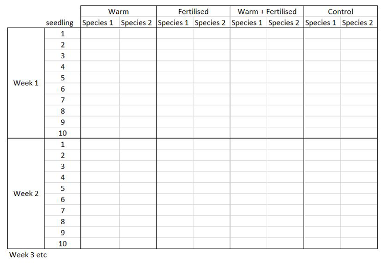
Let’s say you want to run a test to determine whether warming and/or fertilisation affected seedling growth. You may know how your experiment is set up, but R doesn’t! At the moment, with 8 measures per row (combination of all treatments and species for one replicate, or block), you cannot run an analysis. On the contrary, tidy datasets are arranged so that each row represents an observation and each column represents a variable. In our case, this would look something like this:
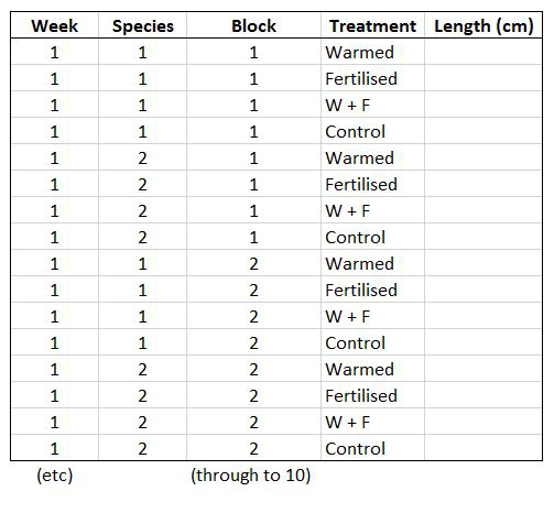
This makes a much longer dataframe row-wise, which is why this form is often called long format. Now if you wanted to compare between groups, treatments, species, etc, R would be able to split the dataframe correctly, as each grouping factor has its own column.
The gather() function from the tidyr package lets you convert a wide-format data frame to a tidy long-format data frame.
Have a look at the first few columns of the LPI data set (LPIdata_Feb2016) to see whether it is tidy:
View(head(LPIdata_Feb2016))
At the moment, each row contains a population that has been monitored over time and towards the right of the data frame there are lots of columns with population estimates for each year. To make this data “tidy” (one column per variable) we can use gather() to transform the data so there is a new column containing all the years for each population and an adjacent column containing all the population estimates for those years:
LPI_long <- gather(data = LPIdata_Feb2016, key = "year", value = "pop", select = 26:70)
This takes our original dataset LPIdata_Feb2016 and creates a new column called year, fills it with column names from columns 26:70 and then uses the data from these columns to make another column called pop.
Because column names are coded in as characters, when we turned the column names (1970, 1971, 1972, etc.) into rows, R automatically put an X in front of the numbers to force them to remain characters. We don’t want that, so to turn year into a numeric variable, use:
LPI_long$year <- parse_number(LPI_long$year)
Using sensible variable names
Have a look at the column names in LPI_long:
names(LPI_long)
The variable names are a mixture of upper and lower case letters and some use . to mark the end of a word. There are lots of conventions for naming objects and variables in programming but for the sake of consistency and making things easier to read, let’s replace any . with _ using gsub()and make everything lower case using tolower():
names(LPI_long) <- gsub(".", "_", names(LPI_long), fixed = TRUE)
names(LPI_long) <- tolower(names(LPI_long))
Each population in the dataset can be identified using the id column, but to group our dataset by species, we would have to group first by genus, then by species, to prevent problems with species having similar names. To circumvent this, we can make a new column which holds the genus and species together using paste():
LPI_long$genus_species_id <- paste(LPI_long$genus, LPI_long$species, LPI_long$id, sep = "_")
Finally, lets look at a sample of the contents of the data frame to make sure all the variables are displayed properly:
View(LPI_long[c(1:5,500:505,1000:1005),])
# You can use [] to subset data frames [rows, columns]
# If you want all rows/columns, add a comma in the row/column location
country_list and biome seem to have some helpful (annoying) , and / to separate entries. This could mess up our analyses so remove them using gsub() as before:
LPI_long$country_list <- gsub(",", "", LPI_long$country_list, fixed = TRUE)
LPI_long$biome <- gsub("/", "", LPI_long$biome, fixed = TRUE)
That took a while, but it’s worth doing to avoid confusion later down the line.
2. Efficiently manipulating data using dplyr
Now that our dataset is tidy we can get it ready for our analysis. This is quite a messy data frame with data from lots of different sources so to help answer our question of how biodiversity has changed since 1970, we should create some new variables and filter out the unnecessary data.
To make sure there are no duplicate rows, we can use distinct():
LPI_long <- distinct(LPI_long)
Then we can remove any rows that have missing or infinite data:
LPI_long_fl <- filter(LPI_long, is.finite(pop))
Next, we want to only use populations that have more than 5 years of data, as population trend estimates from short term studies can be very inaccurate when projected into the future. We should also scale the population data, because since the data come from many species, the units and magnitude of the data are very different - imagine tiny fish whose abundance is in the millions, and large carnivores whose abundance is much smaller. To only keep populations with more than 5 years of data and scale the population data, we can use pipes. Pipes (%>%) are a way of streamlining data manipulation - imagine all of your data coming in one end of the pipe, while they are in there, they are manipulated, summarised, etc., then the output (e.g. your new data frame or summary statistics) comes out the other end of the pipe. At each step of the pipe processing, you can tell the pipe what information to use - e.g. here we are using ., which just means “take the ouput of the previous step”. For more information on data manipulation using pipes, you can check out our data formatting and manipulation tutorial.
LPI_long <- LPI_long_fl %>%
  group_by(., genus_species_id) %>%  # group rows so that each group is one population
  mutate(., maxyear = max(year), minyear = min(year)) %>%  # Create columns for the first and most recent years that data was collected
  mutate(., lengthyear = maxyear-minyear) %>%  # Create a column for the length of time data available
  mutate(., scalepop = (pop-min(pop))/(max(pop)-min(pop))) %>%  # Scale population trend data
  filter(., is.finite(scalepop)) %>%
  filter(., lengthyear > 5) %>%  # Only keep rows with more than 5 years of data
  ungroup(.)  # Remove any groupings you've greated in the pipe, not entirely necessary but it's better to be safe
Now we can explore our data a bit. Let’s create a few basic summary statistics for each biome and store them in a new data frame:
LPI_biome_summ <- LPI_long %>%
  group_by(biome) %>%  # Group by biome
  summarise(populations = n(),   # Create columns, number of populations
            mean_study_length_years = mean(lengthyear),  # mean study length
            max_lat = max(decimal_latitude),  # max latitude
            min_lat = min(decimal_latitude),  # max longitude
            dominant_sampling_method = names(which.max(table(sampling_method))),  # modal sampling method
            dominant_units = names(which.max(table(units))))  # modal unit type
Check out the new data frame using View(LPI_biome_summ) to find out how many populations each biome has, as well as other summary information.
3. Automating data manipulation using lapply(), loops and pipes
Often we want to perform the same type of analysis on multiple species, plots, or any other groups within our data - copying and pasting is inefficient and can easily lead to mistakes, so it’s much better to automate the process within R and avoid all the repetition. There are several ways to do this, including using apply() and it’s variants, loops, and pipes. For more information, you can check out our tutorials on loops and piping, but for now, here is a brief summary.
The apply() function and it’s variants (lapply(),sapply(), tapply(), mapply()) act as wrappers around other functions that you want to apply equally to items in an array (apply()), list (lapply(), sapply()), grouped vector (tapply()), or some other multivariate function (mapply()).
Loops are used for iterative purposes - through loops you are telling R to do something (calculate a mean, make a graph, anything) for each element of a certain list (could be a list of years, species, countries, any category within your data). Loops are the slowest of these three methods to do data manipulation, because loops call the same function multiple times, once for each iteration, and function calls in R are a bottleneck.
Pipes (%>%), as you found out above, are a way of streamlining the data manipulation process. Within the pipe you can group by categories of your choice, so for example we can calculate the LPI for different biomes or countries, and then save the plots.
| Method | Pros | Cons |
|---|---|---|
| lapply() | Quicker than loops, slightly quicker than pipes | More lines of code than pipes |
| loop | Easy to understand and follow, used in other programming languages as well | Slow, memory-intense and code-heavy |
| pipe | Quicker than loops, efficient coding with fewer lines | The code can take a bit of fiddling around till it's right |
Using our data set, we want to create linear models which demonstrate the abundance trend over time, for each of our populations, then extract model coefficients and other useful stuff to a data frame.
You can do this using lapply():
# Create a list of data frames by splitting `LPI_long` by population (`genus_species_id`)
LPI_long_list <- split(LPI_long, f = LPI_long$genus_species_id)  # This takes a couple minutes to run

# `lapply()` a linear model (`lm`) to each data frame in the list and store as a list of linear models
LPI_list_lm <- lapply(LPI_long_list, function(x) lm(scalepop ~ year, data = x))

# Extract model coefficients and store them in a data frame
LPI_models_lapply <- filter(data.frame(
  "genus_species_id" = names(LPI_list_lm),
  "n" = unlist(lapply(LPI_list_lm, function(x) df.residual(x))),
  "intercept" = unlist(lapply(LPI_list_lm, function(x) summary(x)$coeff[1])),
  "slope" = unlist(lapply(LPI_list_lm, function(x) summary(x)$coeff[2])),
  "intercept_se" = unlist(lapply(LPI_list_lm, function(x) summary(x)$coeff[3])),
  "slope_se" = unlist(lapply(LPI_list_lm, function(x) summary(x)$coeff[4])),
  "intercept_p" = unlist(lapply(LPI_list_lm, function(x) summary(x)$coeff[7])),
  "slope_p" = unlist(lapply(LPI_list_lm, function(x) summary(x)$coeff[8])),
  "lengthyear" = unlist(lapply(LPI_long_list, function(x) max((x)$lengthyear)))
), n > 5)
For the sake of completeness, here’s how to do the same using a loop - the code can take hours to run depending on your laptop!
# Create a data frame to store results
LPI_models_loop <- data.frame()

for(i in unique(LPI_long$genus_species_id)) {
  frm <- as.formula(paste("scalepop ~ year"))
  mylm <- lm(formula = frm, data = LPI_long[LPI_long$genus_species_id == i,])
  sum <- summary(mylm)

  # Extract model coefficients
  n <- df.residual(mylm)
  intercept <- summary(mylm)$coeff[1]
  slope <- summary(mylm)$coeff[2]
  intercept_se <- summary(mylm)$coeff[3]
  slope_se <- summary(mylm)$coeff[4]
  intercept_p <- summary(mylm)$coeff[7]
  slope_p <- summary(mylm)$coeff[8]

  # Create temporary data frame
  df <- data.frame(genus_species_id = i, n = n, intercept = intercept,
                   slope = slope, intercept_se = intercept_se, slope_se = slope_se,
                   intercept_p = intercept_p, slope_p = slope_p,
                   lengthyear = LPI_long[LPI_long$genus_species_id == i,]$lengthyear, stringsAsFactors = F)

  # Bind rows of temporary data frame to the LPI_mylmels_loop data frame
  LPI_models_loop <- rbind(LPI_models_loop, df)

}

# Remove duplicate rows and rows where degrees of freedom <5
LPI_models_loop <- distinct(LPI_models_loop)
LPI_models_loop <- filter(LPI_models_loop, n > 5)
Using pipes (this takes a few minutes to run):
LPI_models_pipes <- LPI_long %>%
  group_by(., genus_species_id, lengthyear) %>%
  do(mod = lm(scalepop ~ year, data = .)) %>%  # Create a linear model for each group
  mutate(., n = df.residual(mod),  # Create columns: degrees of freedom
         intercept = summary(mod)$coeff[1],  # intercept coefficient
         slope = summary(mod)$coeff[2],  # slope coefficient
         intercept_se = summary(mod)$coeff[3],  # standard error of intercept
         slope_se = summary(mod)$coeff[4],  # standard error of slope
         intercept_p = summary(mod)$coeff[7],  # p value of intercept
         slope_p = summary(mod)$coeff[8]) %>%  # p value of slope
  ungroup() %>%
  mutate(., lengthyear = lengthyear) %>%
  filter(., n > 5) # Remove rows where degrees of freedom <5
We used the system.time() function to time how long each of these methods took on a 16GB 2.8GHz-i5 Macbook Pro so you can easily compare:
| Method | Total Elapsed Time (s) | User Space Time (s) | System Space Time (s) |
|---|---|---|---|
| loop | 180.453 | 170.88 | 7.514 |
| pipe | 30.941 | 30.456 | 0.333 |
| lapply | 26.665 | 26.172 | 0.261 |
You can do the same by wrapping any of the methods in system.time():
system.time(
	LPI_models_pipes <- LPI_long %>%
  group_by(., genus_species_id) %>%
  do(mod = lm(scalepop ~ year, data = .)) %>%
  mutate(., n = df.residual(mod),
         intercept=summary(mod)$coeff[1],
         slope=summary(mod)$coeff[2],
         intercept_se=summary(mod)$coeff[3],
         slope_se=summary(mod)$coeff[4],
         intercept_p=summary(mod)$coeff[7],
         slope_p=summary(mod)$coeff[8]) %>%
  filter(., n > 5)
	)
Note that you might receive essentially perfect fit: summary may be unreliable warning messages. This tells us that there isn’t any variance in the sample used for certain models, and this is because there are not enough sample points. This is fixed with filter(., n > 5) which removes models that have fewer than 5 degrees of freedom.
These three approaches deliver the same results, and you can choose which one is best for you and your analyses based on your preferences and coding habits.
Now that we have added all this extra information to the data frame, let’s save it just in case R crashes or your laptop runs out of battery:
save(LPI_models_pipes, file = "LPI_models_pipes.RData")

LPI_models_pipes_mod <- LPI_models_pipes %>% select(LPI_models_pipes, -mod)  # Remove `mod`, which is a column of lists (... META!)
write.csv("LPI_models_pipes.csv", LPI_models_pipes_mod)  # This takes a long time to save, don't run it unless you have time to wait.
Compare the .RData file with an equivalent .csv file. .RData files are much more compressed than .csv files, and load into R much more quickly. They are also guaranteed to be in the right format, unlike a .csv, which can have problems with quotes (""), commas (,) and unfinished lines. The only drawback being that they can’t be used by other software.
4. Automating data visualisation using ggplot2 and dplyr
Now that we have quantified how the different populations in the LPI dataset have changed through time, it’d be great to visualise the results. First, we can explore how populations are changing in different biomes through a histogram of slope estimates. We could filter the data for each biome, make a new data frame, make the histogram, save it, and repeat all of this many times, or we could get it done all in one go using ggplot2 and pipes %>%. Here we’ll save the plots as .pdf files, but you could use .png as well. We will also set a custom theme for ggplot2 to use when making the histograms and choose a colour for the bins using Rcolourpicker.
Making your own ggplot2 theme
If you’ve ever tried to perfect your ggplot2 graphs, you might have noticed that the lines starting with theme() quickly pile up - you adjust the font size of the axes and the labels, the position of the title, the background colour of the plot, you remove the grid lines in the background, etc. And then you have to do the same for the next plot, which really increases the amount of code you use. Here is a simple solution - create a customised theme that combines all the theme() elements you want, and apply it to your graphs to make things easier and increase consistency. You can include as many elements in your theme as you want, as long as they don’t contradict one another, and then when you apply your theme to a graph, only the relevant elements will be considered - e.g. for our histograms we won’t need to use legend.position, but it’s fine to keep it in the theme, in case any future graphs we apply it to do have the need for legends.
theme_LPI <- function(){
  theme_bw()+
  theme(axis.text.x=element_text(size=12, angle=45, vjust=1, hjust=1),
        axis.text.y=element_text(size=12),
        axis.title.x=element_text(size=14, face="plain"),
        axis.title.y=element_text(size=14, face="plain"),
        panel.grid.major.x=element_blank(),
        panel.grid.minor.x=element_blank(),
        panel.grid.minor.y=element_blank(),
        panel.grid.major.y=element_blank(),
        plot.margin = unit(c(0.5, 0.5, 0.5, 0.5), units = , "cm"),
        plot.title = element_text(size=20, vjust=1, hjust=0.5),
        legend.text = element_text(size=12, face="italic"),
        legend.title = element_blank(),
        legend.position=c(0.9, 0.9))
}
Picking colours using the Rcolourpicker addin
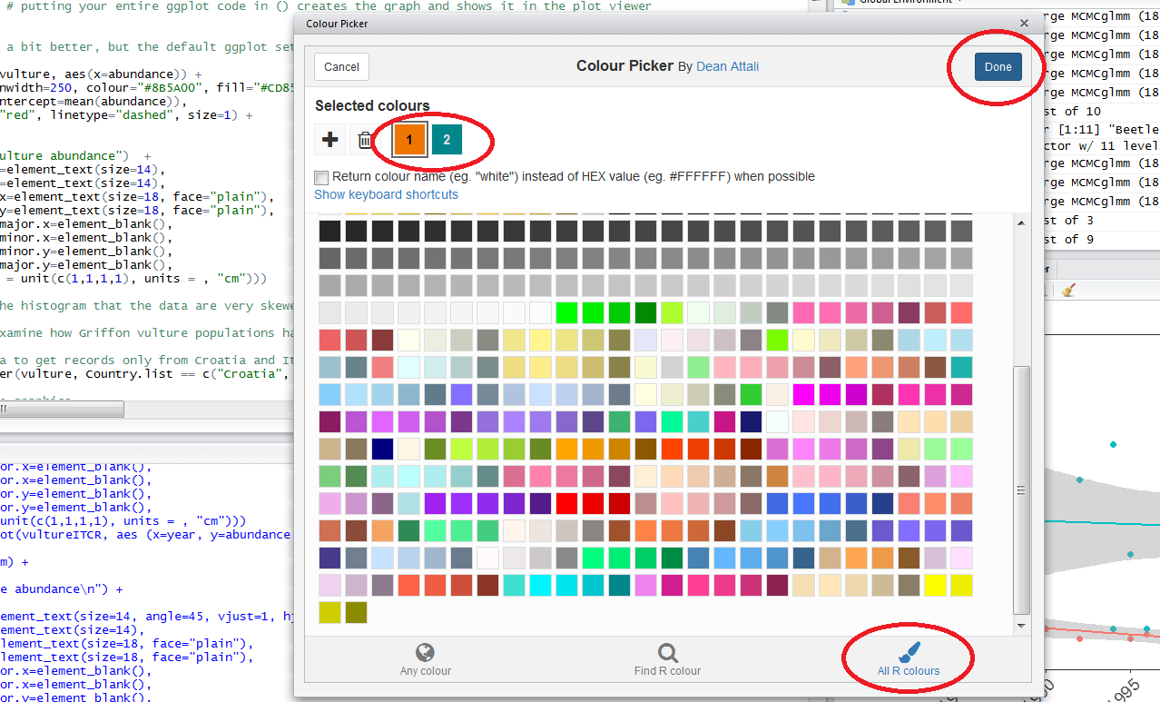
Setting custom colours for your graphs can set them apart from all the rest (we all know what the default ggplot2 colours look like!), make them prettier, and most importantly, give your work a consistent and logical colour scheme. Finding the codes, e.g. colour="#8B5A00", for your chosen colours, however, can be a bit tedious. Though one can always use Paint / Photoshop / google colour codes, there is a way to do this within RStudio thanks to the addin colourpicker. RStudio addins are installed the same way as packages, and you can access them by clicking on Addins in your RStudio menu. To install colourpicker, run the following code:
install.packages("colourpicker")
To find out what is the code for a colour you like, click on Addins/Colour picker.
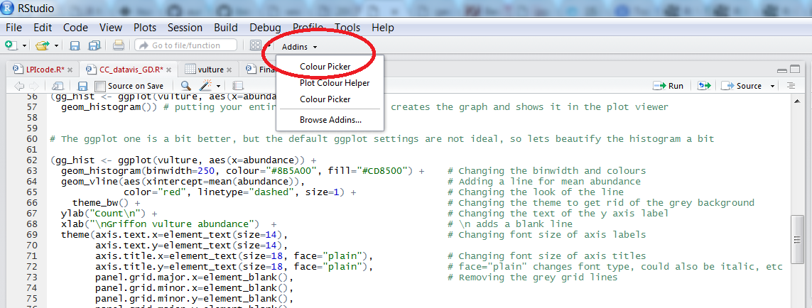
When you click on All R colours you will see lots of different colours you can choose from - a good colour scheme makes your graph stand out, but of course, don’t go crazy with the colours. When you click on 1, and then on a certain colour, you fill up 1 with that colour, same goes for 2, 3 - you can add mode colours with the +, or delete them by clicking the bin. Once you’ve made your pick, click Done. You will see a line of code c("#8B5A00", "#CD8500") appear - in this case, we just need the colour code, so we can copy that, and delete the rest.
Plotting histograms of population change in different biomes and saving them
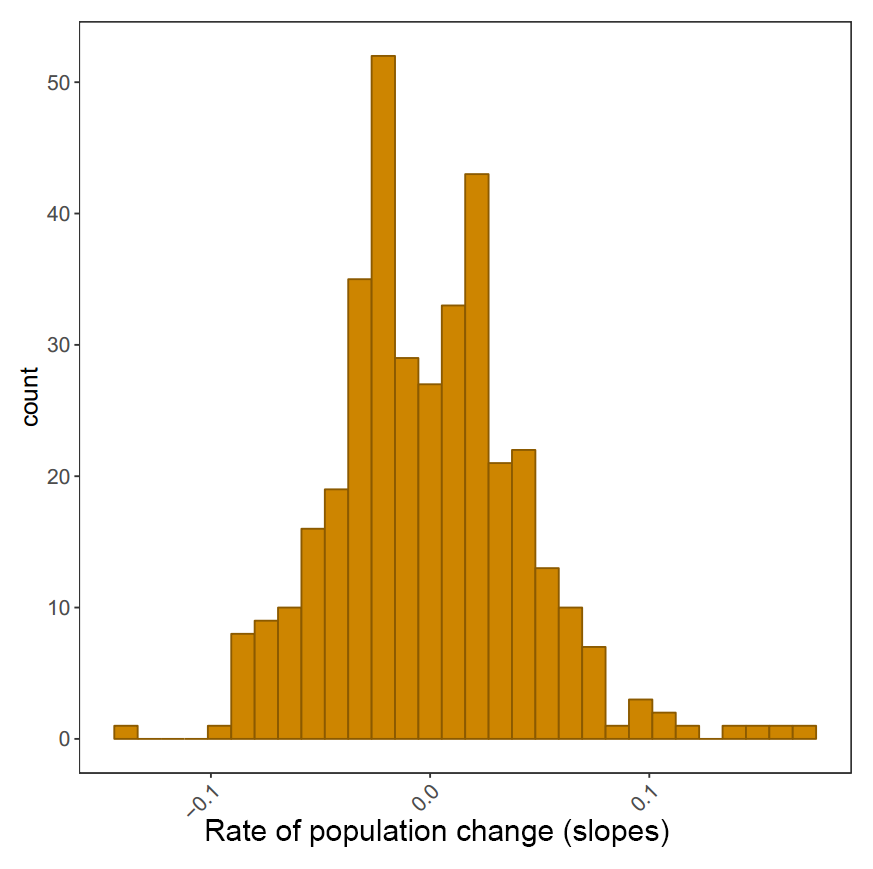
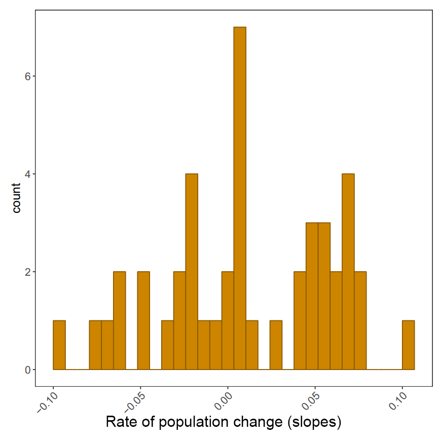
We can take our pipe efficiency a step furher using the broom package. In the three examples above, we extracted the slope, standard error, intercept, etc., line by line, but with broom we can extrack model coefficients using one single line tidy(model_name). We can practice using broom whilst making the histograms of population change in different biomes (measured by the slope for the year term). You will need to create a Biome_LPI folder, where your plots will be saved, before you run the code.
biome.plots <- LPI_long %>%
  group_by(., genus_species_id, biome) %>%
  do(mod = lm(scalepop ~ year, data = .)) %>%
  tidy(mod) %>%
  select(., genus_species_id, biome, term, estimate) %>%  # Selecting only the columns we need
  spread(., term, estimate) %>%  # Splitting the estimate values in two columns - one for intercept, one for year
  ungroup() %>%  # We need to get out of our previous grouping to make a new one
  group_by(., biome) %>%
  do(ggsave(ggplot(.,aes(x = year)) + geom_histogram(colour="#8B5A00", fill="#CD8500") + theme_LPI()
            + xlab("Rate of population change (slopes)"),
            filename = gsub("", "", paste("Biome_LPI/", unique(as.character(.$biome)), ".pdf", sep="")), device="pdf"))
The histograms will be saved in your working directory. You can use getwd() to find out where that is, if you’ve forgotten. Check out the histograms - how does population change vary between the different biomes?
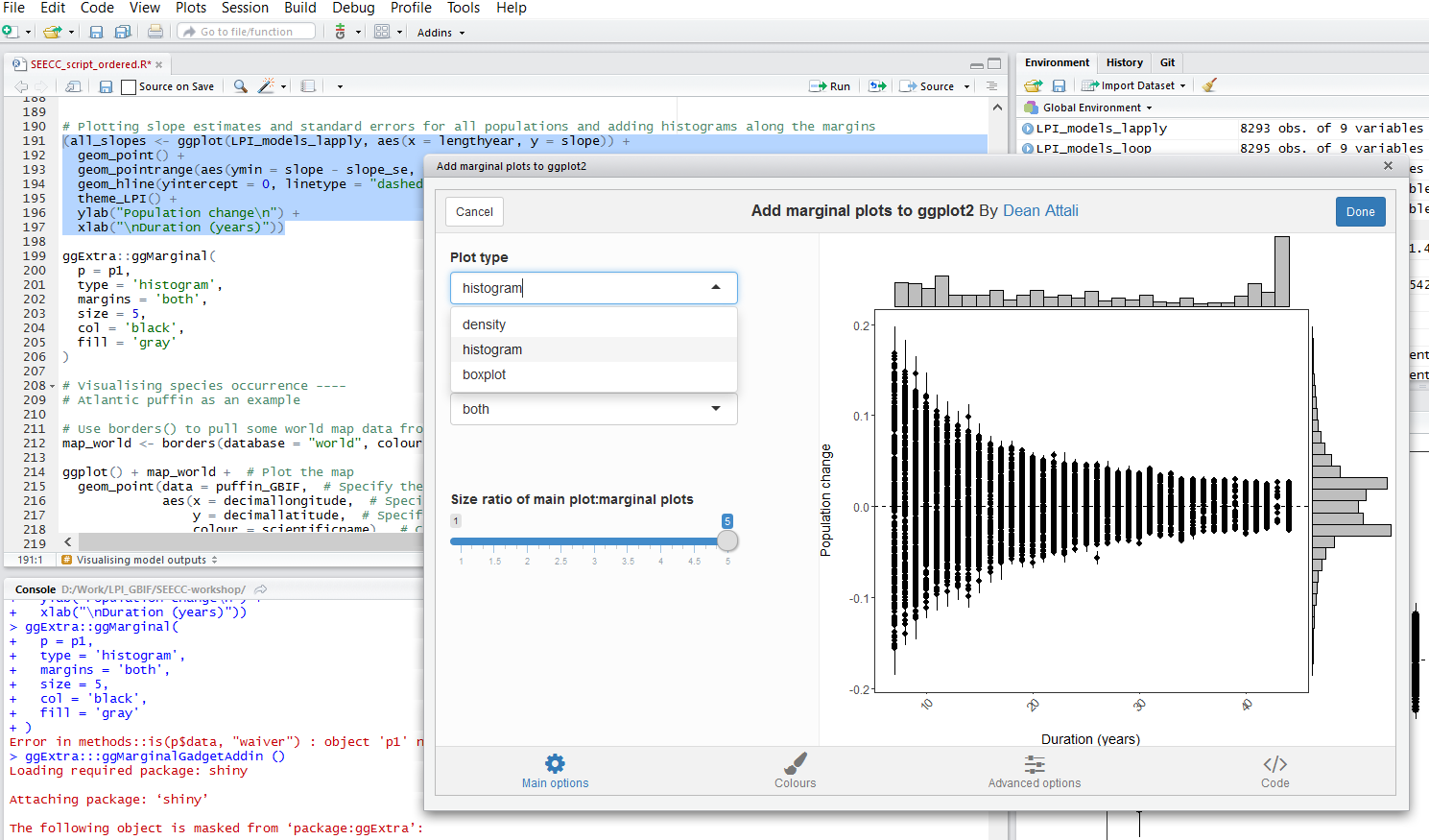
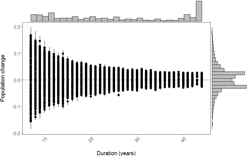
Ploting slope estimates for population change versus duration of monitoring and adding histograms along the margins
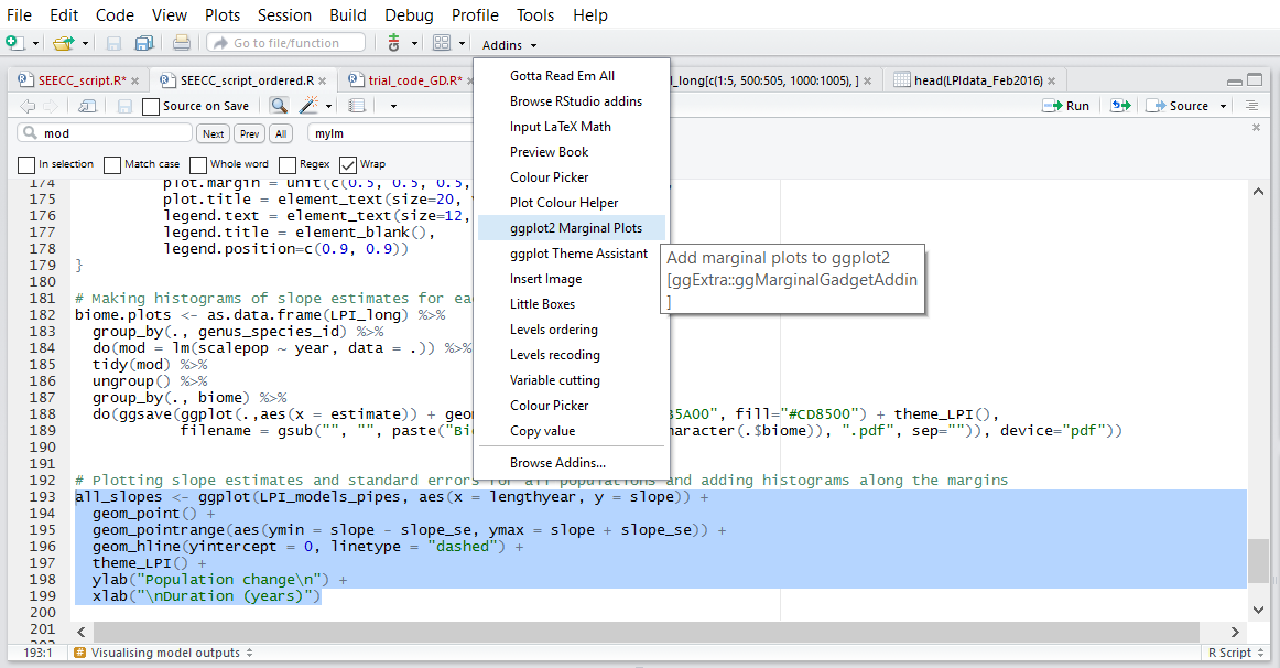
Within RStudio, you can use addins, including Rcolourpicker that we dicussed above, and ggExtra that we will use for our marginal histograms.
Making our initial graph:
(all_slopes <- ggplot(LPI_models_pipes, aes(x = lengthyear, y = slope)) +
  geom_point() +
  geom_pointrange(aes(ymin = slope - slope_se, ymax = slope + slope_se)) +
  geom_hline(yintercept = 0, linetype = "dashed") +
  theme_LPI() +
  ylab("Population change\n") +
  xlab("\nDuration (years)"))
Once you’ve installed the package by running install.packages("ggExtra"), you can select the ggplot2 code, click on ggplot2 Marginal Histograms from the Addin menu and build your plot. Once you click Done, the code will be automatically added to your script.
Here is the final graph - what do you think, how has biodiversity changed in the last ~40 years?
Visualising species occurrence
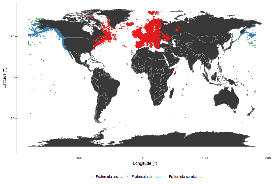
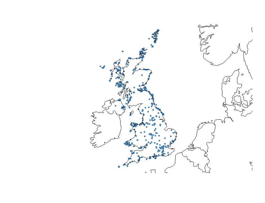
As an intro to the next section of the workshop, we’re going to have a look at the distribution of the Atlantic Puffin, using public data from the Global Biodiversity Information Facility, found in puffin_GBIF.RData.
Firstly, use borders() to pull some world map data from the maps package:
map_world <- borders(database = "world", colour = "gray50", fill = "#383838") # We used the `Colour Picker` Addin to pick the colours
Then create the plot using ggplot():
ggplot() + map_world +  # Plot the map
  geom_point(data = puffin_GBIF,  # Specify the data for geom_point()
             aes(x = decimallongitude,  # Specify the x axis as longitude
                 y = decimallatitude,  # Specify the y axis as latitude
                 colour = scientificname),  # Colour the points based on species name
             alpha = 0.4,  # Set point opacity to 40%
             size = 1) +  # Set point size to 1
  scale_color_brewer(palette = "Set1") +   # Specify the colour palette to colour the points
  theme_classic() +  # Remove gridlines and shading inside the plot
  ylab(expression("Latitude ("*degree*")" )) +  # Add a smarter x axis label
  xlab(expression("Longitude ("*degree*")" )) +  # Add a smarter y axis label
  theme(legend.position = "bottom",  # Move the legend to below the plot
        legend.title = element_blank())  # Remove the legend title
We used a colour palette from RColorBrewer to colour the points (Set1). You can see all the colour palettes by running display.brewer.all() in R.
5. Species occurrence maps based on GBIF and Flickr data
In this part of the tutorial we will use two datasets, one from the Global Biodiversity Information Facility (GBIF) and one from Flickr, to create species occurrence maps.
So called “big data” are being increasingly used in the life sciences because they provide a lot of information on large scales and very fine resolution. However, these datasets can be quite tricky to work with. Most of the time the data is in the form of presence-only records. Volunteers, or social media users, take a picture or record the presence of a particular species and they report the time of the sighting and its location. Therefore what we have is thousands of points with temporal and spatial information attached to them.
We will go through different steps to download, clean and visualise this type of data. We will start with downloading all the occurrences of atlantic puffin in the UK that are in the GBIF database. Then we will do some spatial manipulation of data attached to pictures of atlantic puffins taken in the UK and uploaded on Flickr. Finally, we will produce density maps of both of these datasets to look for hotspots of puffins and/or puffin watchers.
Download puffin occurrences from GBIF
First install and load all the package needed.
library(rgbif)
The package rgbif offers an interface to the Web Service methods provided by GBIF. It includes functions for searching for taxonomic names, retrieving information on data providers, getting species occurrence records, and getting counts of occurrence records.
In the GBIF dataset every country has a unique code. We can find out the code for the UK with this line of code.
UK_code <- isocodes[grep("United Kingdom", isocodes$name), "code"]
Now we can download all the occurrence records for the atlantic puffin in the UK using the function occ_search.
occur<-occ_search(scientificName = "Fratercula arctica", country = UK_code, hasCoordinate = TRUE, limit=3000, year = '2006,2016', return = "data")
This will return a dataset of all the occurrences of atlantic puffin recorded in the UK between 2006 and 2016 that have geographic coordinates.
Have a look at the dataset.
str(occur)
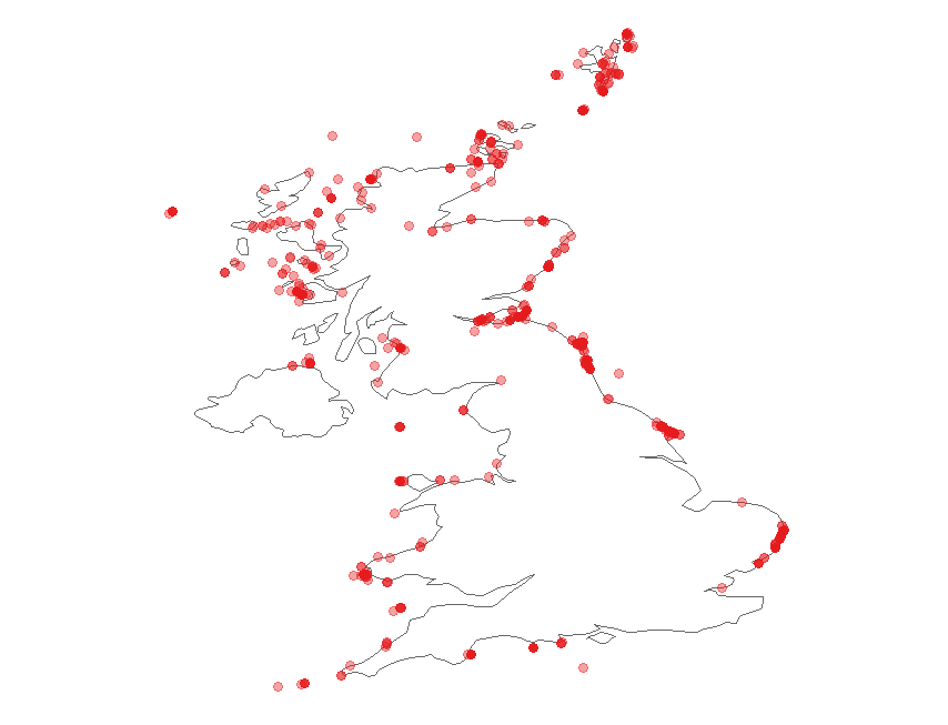
Now we can plot the occurrences on a map of the UK. rgbif has its own function to visualise the data, but later on in the tutorial we will learn how to make prettier maps.
gbifmap(occur, region="UK")
Clean data from Flickr
We will now use the dataset flickr_puffins.txt. This dataset has been collected from Flickr Application Programming Interface (API), which is an interface through which softwares can interact with each other. APIs make it easy for developers to create applications which access the features or data of an operating system, application or other service. Because of time constraints we are not going to go through the code to download data from Flick API, but you can find the script here and I am happy to help if you find something unclear.
First load the dataset and have a look at it.
flickr<-read.table("./flickr_puffins.txt",header=T)
str(flickr)
The variables id and owner are the unique identifier for the photograph and for the photographer, respectively. The dataset also contains the date on which the photo was taken, in the original format (datetaken) and broken down into month and year. The variable dateonly is the character string containing only the date and ignoring the time when the picture was taken. The data frame also has the geographic coordinates of the place where the picture was taken.
Let’s have a first look at the data.
We can quickly plot the data using the package sp.
library(sp) #load the package
geopics<- flickr[,c(4,5)] #subset the dataset to keep coordinates only
coordinates(geopics)<-c("longitude","latitude") #make it spatial
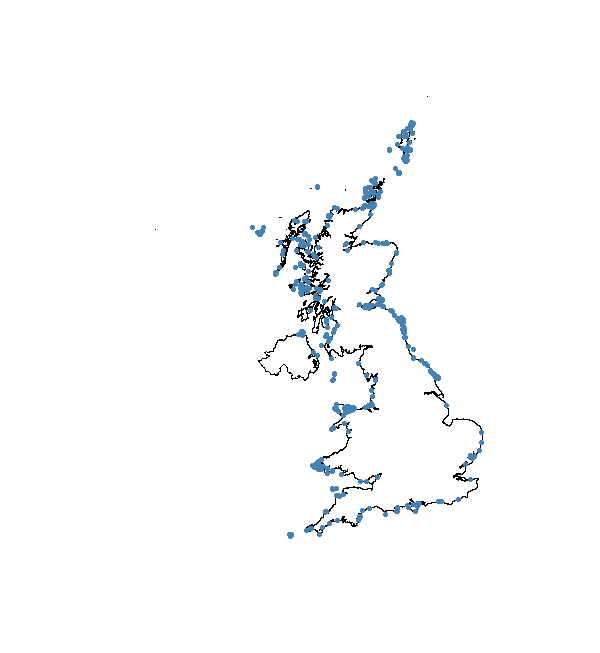
plot(geopics) #plot it
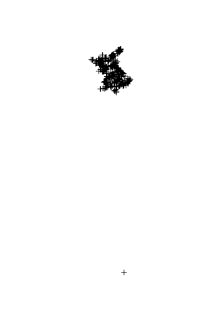
The function coordinates sets spatial coordinates to create a Spatial object, or retrieves spatial coordinates from a Spatial object.
The first thing we notice is that one point is clearly not in the UK and there are a few points in the Channel Islands, which we will delete. To do this we just need to find which points have latitude value that is smaller than the most southern point of the UK and delete them from the dataset.
which(flickr$latitude < 49.9)
flickr <- flickr[-which(flickr$latitude < 49.9),]
Let’s check that all the points are in the UK now, using a nicer plot. We first assign a particular coordinate refernce system (CRS) to the data. A CRS defines, with the help of coordinates, how a two-dimensional map is related to real places on the earth. Since the coordinates in our dataset are recorded as decimal degrees we can assign our spatial object a Geographic Coordinate System (GCS). WGS 1984 is the most commonly used GCS so that’s what we will use. If you want to know more about CRS in R here is a useful link.
coordinates(flickr) <- c("longitude", "latitude")             # go back to original dataframe and make it spatial
crs.geo <- CRS("+proj=longlat +ellps=WGS84 +datum=WGS84")  # geographical, datum WGS84
proj4string(flickr) <- crs.geo                             # assign the coordinate system
plot(flickr, pch = 20, col = "steelblue")                  # plot the data
We can also add the UK coastline to the plot using the package rworldmap.
library(rworldmap)
data(countriesLow)
plot(countriesLow, add = T)
There is one more problem we need to solve. Some of the data points are not on the coast, which means that these pictures are probably not puffins. In order to delete them, we are going to use the UK coastline to select only the datapoints that are within 1Km of the coast and the ones that are on the sea. The first step is to split the dataset into a marine and a terrestrial one. After that we can select from the terrestrial dataset only the points that are on the coast. Finally, we will put the marine and coastal points together. This is only one of the possible ways in which you can do this, another common one being the use of a buffer around the coastline.
First we load all the packages that we need.
library(rgdal)
library(rgeos)
library(raster)
library(maptools)
Now we use a shapefile available in the Global Administrative Areas (GADM) database. A shapefile is a format file for storing location and attribute information of geographic features, which can be represented by points, lines or polygons.
UK <- getData("GADM", country = "GB", level = 0)
At the moment, we are using a GCS, which means that the units of the geometry are in decimal degrees. If we want to select data points according to their distance in Km from the coastline we need to transform our spatial datasets into projected coordinate systems, so the units of the distance will be in meters and not decimal degrees. Universal Transverse Mercator (UTM) is commonly used because it tends to be more locally accurate and has attributes that make the estimating distance easy and accurate. In R it is pretty easy to transform a spatial object into a projected coordinate system, in fact you only need one function.
UK_proj <- spTransform(UK, CRS("+proj=utm +datum=WGS84 +no_defs +ellps=WGS84 +towgs84=0,0,0 "))
flickr_proj <- spTransform(flickr, CRS("+proj=utm +datum=WGS84 +no_defs +ellps=WGS84 +towgs84=0,0,0 "))
The UK shapefile is composed of many polygons, we can simplify it by dissolving the polygons. This will speed things up.
UK_diss <- gUnaryUnion(UK_proj)
Now we perform an overlay operation using the function over. This will identify which of our datapoints fall within the UK shapefile and return NAs when they do not. According to this result then we can divide our dataset into a marine dataset NA and a terrestrial one.
flickr_terr <- flickr_proj[which(is.na(over(flickr_proj, UK_diss, fn = NULL)) == FALSE),]
flickr_mar <- flickr_proj[which(is.na(over(flickr_proj, UK_diss, fn = NULL)) == TRUE),]
Plot the two datasets to make sure it worked.
par(mfrow = c(1,2))
plot(flickr_terr)
plot(flickr_mar)
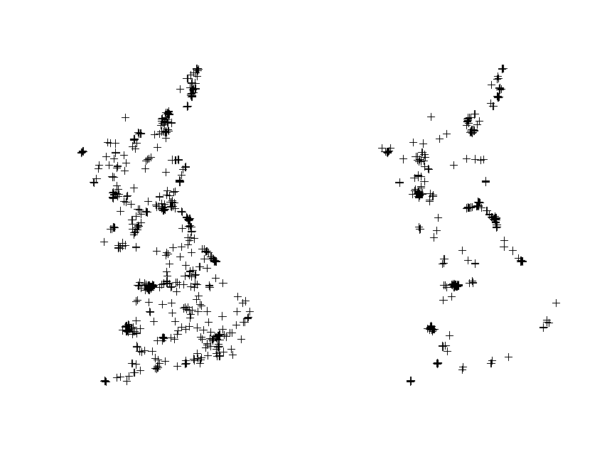
Now we can select the coastal points from the terrestrial dataset. In order to calculate the distance of every point from the coastline we need to transform our UK polygon shapefile to a line shapefile. Again this operation is pretty straightforward in R.
UK_coast <- as(UK_diss, 'SpatialLines')
The next chuck of code calculates the distance of every point to the coast and selects only those that are within 1 km using the function gWithinDistance. Then it transforms the output into a dataframe and uses it to select only the coastal points from the original Flickr dataset.
dist <- gWithinDistance(flickr_terr, UK_coast, dist = 1000, byid = T)
dist.df <- as.data.frame(dist)
flickr_coast <- flickr_terr[which(dist.df == "TRUE"),]
Plot to check it worked.
plot(flickr_coast)
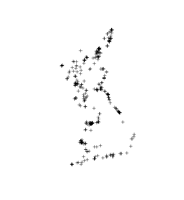
Now we can put the marine and coastal datasets together and plot to check that it worked.
flickr_correct <- spRbind(flickr_mar,flickr_coast)
plot(UK_coast)
points(flickr_correct, pch = 20, col = "steelblue")
Density maps
Now that we have the datasets cleaned, it is time to make some pretty maps. When you have presence-only data one of the things you might want to do is to check whether there are hotspots. Density maps made with ggplot2 can help you visualise that.
We start with the Flickr data. First we need to transform our spatial datasets into a format that ggplot2 is able to read.
UK.Df <- fortify(UK_diss, region = "ID_0")
flickr.points <- fortify(cbind(flickr_correct@data, flickr_correct@coords))
Now we can build our map with ggplot2. If you want to know more about the way you build plots in ggplot2 here is a useful link. One feature that you might want to take notice of is the use of fill = ..level.., alpha = ..level... This syntax sets the colour and transparency of your density layer as dependent on the density itself. The stat_ functions compute new values (in this case the level variable using the kde2d function from the package MASS) and create new dataframes. The ..level.. tells ggplot to reference that column in the newly built data frame. The two dots indicate that the variable level is not present in the original data, but has been computed by the stat_ function.
plot.years <- ggplot(data = flickr.points, aes(x = longitude, y = latitude)) +  # plot the flickr data
  geom_polygon(data = UK.Df,aes(x = long, y = lat, group = group),            # plot the UK
               color = "black", fill = "gray82") + coord_fixed() +    # coord_fixed() ensures that one unit on the x-axis is the same length as one unit on the y-axis
  geom_point(color = "dodgerblue4",size = 2,shape = ".")+                   # graphical parameters for points
  stat_density2d(aes(x = longitude,                           # create the density layer based on where the points are
                     y = latitude,  fill = ..level.., alpha = ..level..),   # colour and transparency depend on density
                 geom = "polygon", colour = "grey95",size=0.3) +            # graphical parameters for the density layer
  scale_fill_gradient(low = "yellow", high = "red") +                 # set colour palette for density layer
  scale_alpha(range = c(.25, .5), guide = FALSE) +                    # set transparency for the density layer
  facet_wrap(~ year)+                                                 # multipanel plot according to the variable "year" in the flickr dataset
  theme(axis.title.x=element_blank(), axis.text.x=element_blank(),  # don't display x and y axes labels, titles and tickmarks
        axis.ticks.x=element_blank(),axis.title.y=element_blank(),
        axis.text.y=element_blank(), axis.ticks.y=element_blank(),
        text=element_text(size=18),legend.position = c(.9, .15),       # size of text and position of the legend
        panel.grid.major = element_blank(),                            # eliminates grid lines from background
        panel.background = element_blank())                            # set white background

# now plot, it takes a while!
plot.years
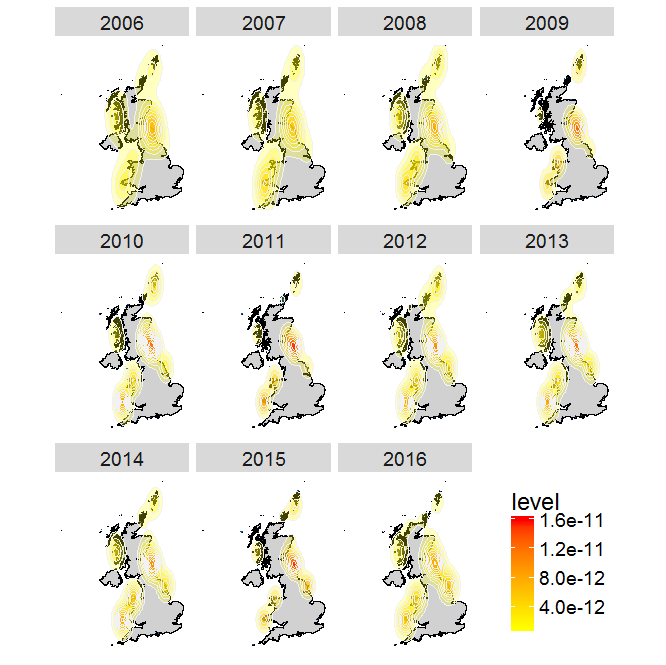
You can see from this plot that there are a few hotspots for watching puffins in the UK, such as the Farne Islands, shetland and Flamborough Head.
Now try to build your own plot for the GBIF data. Remeber to:
- make the
occurdataset spatial withcoordinates() - assigning the right coordinate system with
proj4string() - transform the coordinates to UTM with
spTransform() - use
fortify()to make it readable byggplot2 - build your plot with
ggplot
If you get stuck you can find the code in the script SEECC_script_final.R here.
This tutorial was prepared for a workshop on quantifying biodiversity change at the Scottish Ecology, Environment and Conservation Conference on 3rd April in Aberdeen. The workshop organisation and preparation of teaching materials were supported by the Global Environment & Society Academy Innovation Fund.