Introduction to ggplot2
- Author: Marianna Chimienti
- Contact: r03mc13@abdn.ac.uk
- Research field: Behavioural ecology
ggplot2 is an R package to create beautiful and informative data visualisations. The gg in ggplot2 stands for “grammar of graphics”, which referes to the way you build plots using this package. Every element in the plot is a layer and you build your data visualisation by putting all these layrs together. ggplot2 is incredibly flexible and gives you total control over every element in the graph while being very intuitive and easy to use. In this tutorial you will learn the basics of ggplot2 syntax and make some beautiful data visualisation.
So let’s dive into it!
First load the package with:
library(ggplot2)
If you don’t have ggplot2, you can install it with install.packages().
Scatterplots
In this section you will produce different scatterplots, while also learning how to cstomise different elements of a plot. First we load some data, we use mtcars already available in R and we create some factors with value labels.
data(mtcars)
mtcars$gear <-factor(mtcars$gear,levels=c(3,4,5),
  	labels=c("3gears","4gears","5gears"))
mtcars$am <- factor(mtcars$am,levels=c(0,1),
  	labels=c("Automatic","Manual"))
mtcars$cyl <- factor(mtcars$cyl,levels=c(4,6,8),
   labels=c("4cyl","6cyl","8cyl"))
Now we want to produce a scatterplot of mpg vs. hp for each combination of gears and cylinders in each facet, transmittion type is represented by shape and color. There are many ways of producing a scatterplot:
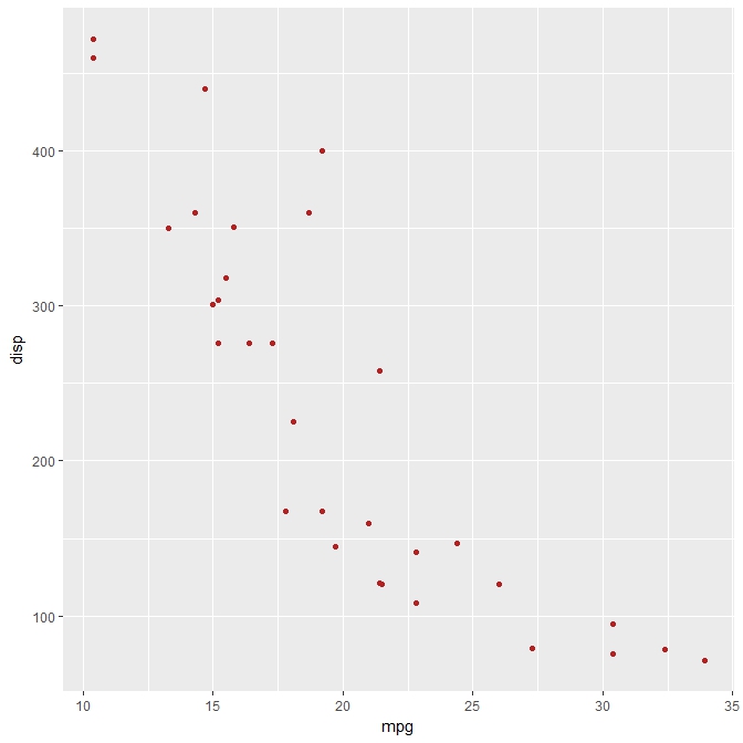
1. basic scatterplot, we save the plot as an object called “g”, you can call it as you want! The ggplot function uses the aestetic (aes) to display x and y.
g<-ggplot(data=mtcars, aes(x=mpg, y=disp))+geom_point(color="firebrick")
g
2. Same basic scatterplot with a black and white theme (theme_bw function), note also the difference in coding the same scatterplot, what has changed?
g <- ggplot()
g <- g + theme_bw()
g <- g + geom_point(data=mtcars, aes(x=mpg, y=disp),color="firebrick")
g
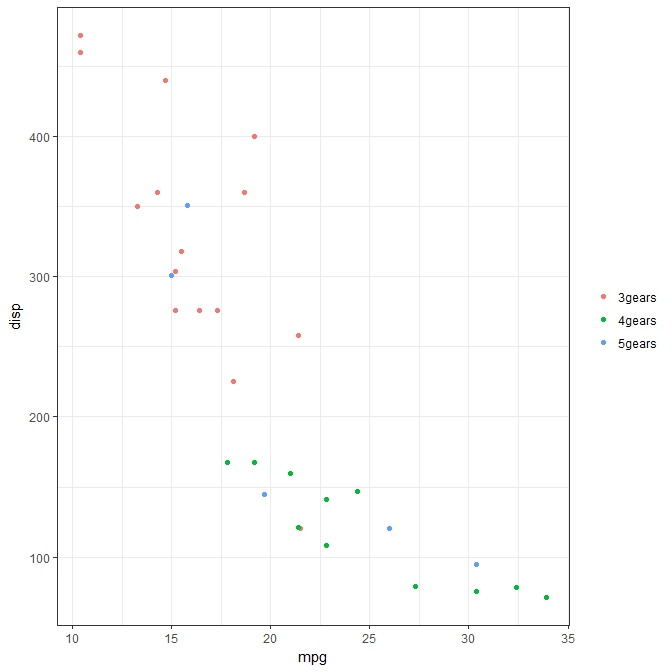
3. Add colours depending on third variable (colour depending by the type of gear) + legend manipulation (theme function)
g <- ggplot()
g <- g + theme_bw()
g <- g + geom_point(data=mtcars, aes(x=mpg, y=disp,colour=gear)) +theme(legend.title=element_blank())
g
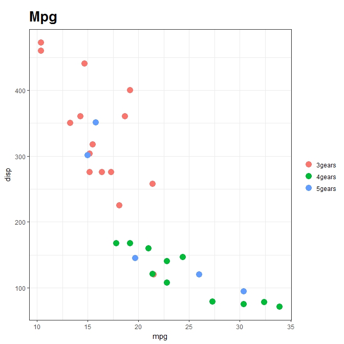
4. Add title to the plot (ggtitle), change size of points in the legend (guides) and type of text in the title, again using theme function
g <- ggplot()
g <- g + theme_bw()
g <- g + geom_point(data=mtcars, aes(x=mpg, y=disp,colour=gear),size = 4.0) +theme(legend.title=element_blank())+
     guides(colour = guide_legend(override.aes = list(size=4)))+
     ggtitle('Mpg')+theme(plot.title = element_text(size=20, face="bold", margin = margin(10, 0, 10, 0)))
g
5. Add x and y labels (labs), change text size
g <- ggplot()
g <- g + theme_bw()
g <- g + geom_point(data=mtcars, aes(x=mpg, y=disp,colour=gear),size = 4.0) +theme(legend.title=element_blank())+
     guides(colour = guide_legend(override.aes = list(size=4)))+
     ggtitle('Mpg')+theme(plot.title = element_text(size=20, face="bold", margin = margin(10, 0, 10, 0)))
g<- g + labs(x = "mpg", y="disp") +theme(text = element_text(size=20))
g
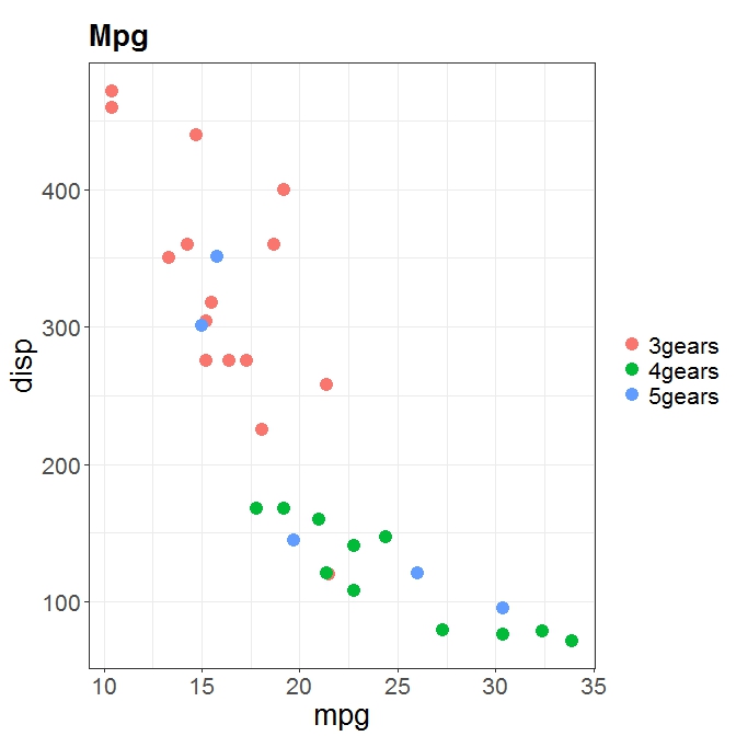
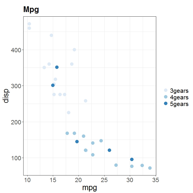
6. Change scale label (scale_colour_brewer function), have a look at all the color pallettes!
g <- ggplot()
g <- g + theme_bw()
g <- g + geom_point(data=mtcars, aes(x=mpg, y=disp,colour=gear),size = 4.0) +theme(legend.title=element_blank())+
     guides(colour = guide_legend(override.aes = list(size=4)))+
     ggtitle("Mpg")+theme(plot.title = element_text(size=20, face="bold", margin = margin(10, 0, 10, 0)))
g<- g + labs(x = "mpg", y="disp") +theme(text = element_text(size=20))+ scale_colour_brewer("Diamond\nclarity")
g
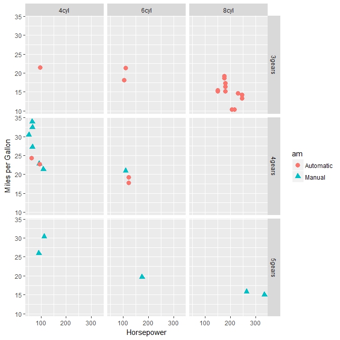
Faceting
Faceting forms a matrix of panels defined by row and column facetting variables. It is most useful when you have two discrete variables, and all combinations of the variables exist in the data.
qplot(hp, mpg, data=mtcars, shape=am, color=am,
   facets=gear~cyl, size=I(3),
   xlab="Horsepower", ylab="Miles per Gallon")
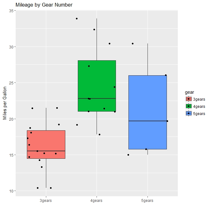
Boxplots
Now we will produce some boxplots and introduce some more customisation, like making a colour palette. We use the same dataset to produce a boxplot of mpg by number of gears. The observations (points) are overlayed and jittered. Can you make the axis labes and numbers bigger?
qplot(gear, mpg, data=mtcars, geom=c("boxplot", "jitter"),
   fill=gear, main="Mileage by Gear Number",
   xlab="", ylab="Miles per Gallon")
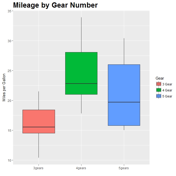
Now we make our colour palette manually: we use scale_fill_discrete (fills with standard colors belonging to the standard color palette in ggplot2) and scale_fill_manual functions (you define your own colors), have a look on the ggplot2 website in how many ways you can define this
BoxplotCars<-ggplot()
BoxplotCars<-BoxplotCars+geom_boxplot(data=mtcars, aes(x=gear,y=mpg,fill=gear)) + ggtitle("Mileage by Gear Number") +
             theme(plot.title = element_text(size=20, face="bold"))+
             labs(x = "", y="Miles per Gallon")

BoxplotCars<-BoxplotCars + scale_fill_discrete(name="Gear",
                         breaks=c("3gears", "4gears", "5gears"),    #note the difference between breaks and labels!!!
                         labels=c("3 Gear", "4 Gear", "5 Gear"))

BoxplotCars
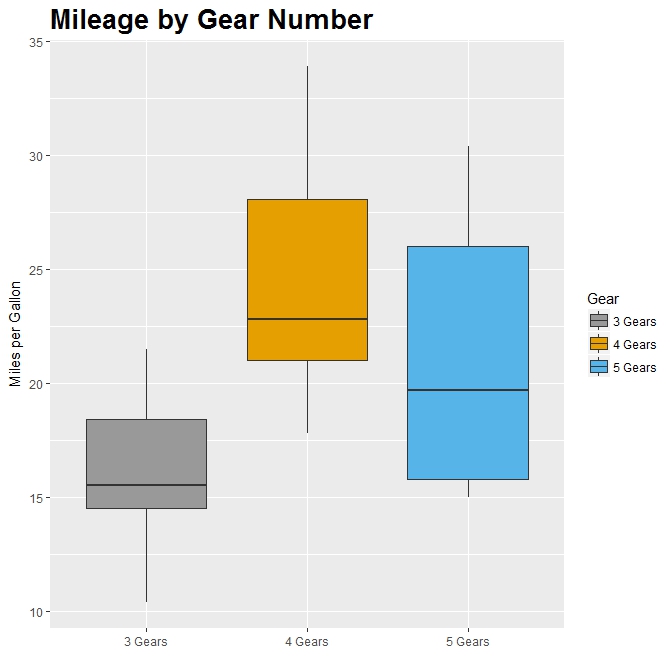
We can use a manual scale instead of hue.
BoxplotCars<-ggplot()
BoxplotCars<-BoxplotCars+geom_boxplot(data=mtcars, aes(gear, mpg,fill=gear)) + ggtitle("Mileage by Gear Number") +
             theme(plot.title = element_text(size=20, face="bold"))+
             labs(x = "", y="Miles per Gallon") + scale_x_discrete(labels=c("3 Gears", "4 Gears", "5 Gears"))

BoxplotCars<-BoxplotCars + scale_fill_manual(values=c("#999999", "#E69F00", "#56B4E9"),  #are you familiar with how we specify the colors?
                         name="Gear",
                         breaks=c("3gears", "4gears", "5gears"),
                         labels=c("3 Gears", "4 Gears", "5 Gears"))


BoxplotCars
Let’s play around with another dataset and discover some more functionalities in ggplot2.
First load the data and do some basic data manipulation.
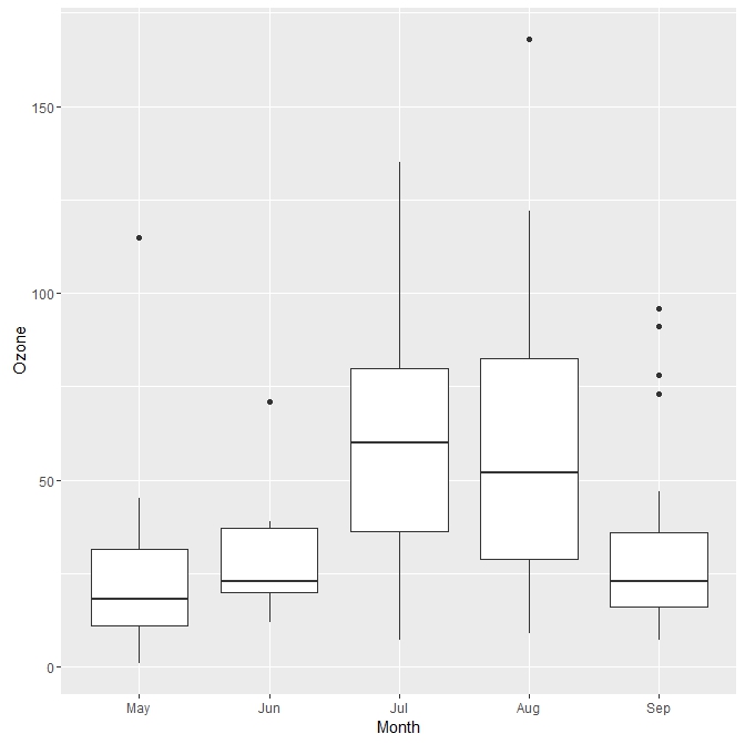
data(airquality)
airquality$Month <- factor(airquality$Month,labels = c("May", "Jun", "Jul", "Aug", "Sep"))
Now produce a basic boxplot of Ozone against month.
AirQuality <- ggplot(airquality, aes(x = Month, y = Ozone)) +
        geom_boxplot()
AirQuality
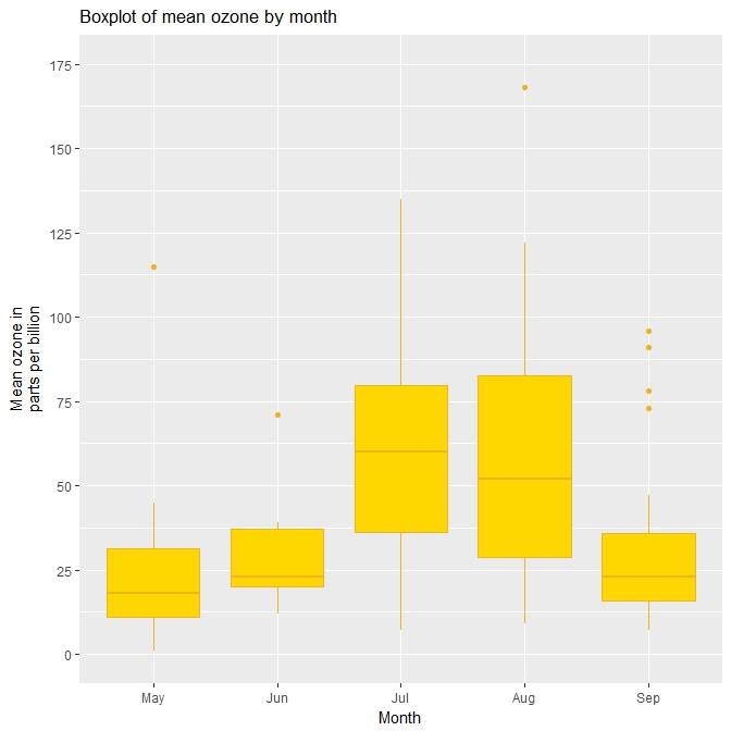
Now we change the colour of the boxes, the title and the y axis. Any problem with the plot?
fill <- "gold1"
ColourBox <- "goldenrod2"

AirQuality <- ggplot(airquality, aes(x = Month, y = Ozone)) +
        geom_boxplot(fill = fill, colour = ColourBox) +
        scale_y_continuous(name = "Mean ozone in\nparts per billion",
                           breaks = seq(0, 175, 25),
                           limits=c(0, 175)) +
        scale_x_discrete(name = "Month") +
        ggtitle("Boxplot of mean ozone by month")
AirQuality
Let`s customise the plot a bit more . We create 2 more variables.
airquality_trimmed <- airquality[which(airquality$Month == "Jul" |
                                       airquality$Month == "Aug" |
                                       airquality$Month == "Sep"), ]

airquality_trimmed$Temp.f <- factor(ifelse(airquality_trimmed$Temp > mean(airquality_trimmed$Temp),
                                                                     1,0), labels = c("Low temp", "High temp"))
Now with the new dataframe we make a boxplots looking at Ozone during 3 months: July, Aug and Sep, highlighting also the role of the temperature (fecet_grid).
fill <- "gold1"
lineBox <- "black"

AirQuality <- ggplot(airquality_trimmed, aes(x = Month, y = Ozone)) +
        geom_boxplot(fill = fill, colour = lineBox,                         #customise colour and line of the boxplot
                     alpha = 0.7) +
        scale_y_continuous(name = "Mean ozone in\nparts per billion",
                           breaks = seq(0, 175, 50),
                           limits=c(0, 175)) +
        scale_x_discrete(name = "Month") +
        ggtitle("Boxplot of mean ozone by month") +
        theme_bw() +
        theme(plot.title = element_text(size = 14, family = "Tahoma", face = "bold"),  #cutomise text!
              text = element_text(size = 12, family = "Tahoma"),
              axis.title = element_text(face="bold"),
              axis.text.x=element_text(size = 11)) +
        facet_grid(. ~ Temp.f)   #display by temperature
AirQuality
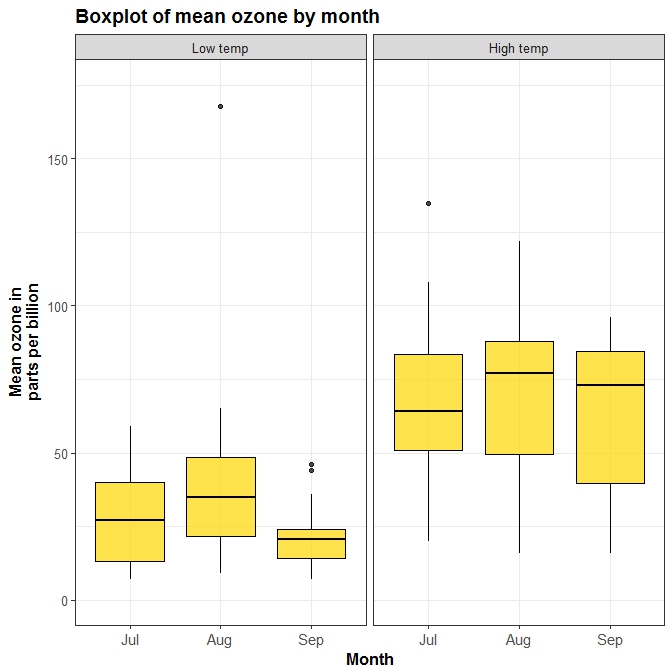
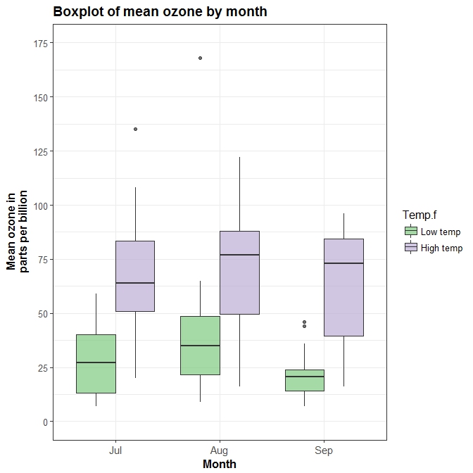
You can also easily group box plots by the levels of another variable. There are two options, in separate (panel) plots, or in the same plot. In order to make the graphs a bit clearer, we’ve kept only months “July”, “Aug” and “Sep” in a new dataset airquality_trimmed. We’ve also mean-split Temp so that this is also categorical, and made it into a new labelled factor variable called Temp.f.In order to produce a panel plot by temperature, we add the facet_grid(. ~ Temp.f) option to the plot.
library(RColorBrewer)

AirQuality <- ggplot(airquality_trimmed, aes(x = Month, y = Ozone, fill = Temp.f)) +
        geom_boxplot(alpha=0.7) +
        scale_y_continuous(name = "Mean ozone in\nparts per billion",
                           breaks = seq(0, 175, 25),
                           limits=c(0, 175)) +
        scale_x_discrete(name = "Month") +
        ggtitle("Boxplot of mean ozone by month") +
        theme_bw() +
        theme(plot.title = element_text(size = 14, family = "Tahoma", face = "bold"),
              text = element_text(size = 12, family = "Tahoma"),
              axis.title = element_text(face="bold"),
              axis.text.x=element_text(size = 11)) +
        scale_fill_brewer(palette = "Accent")
AirQuality
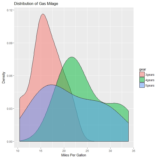
Kernel density plots
We can also create kernel density plots with the function qplot. Let’s go back to the cars dataset and produce a density plot of the variable mpg grouped by number of gears (indicated by color).
qplot(mpg, data=mtcars, geom="density", fill=gear, alpha=I(.5),
   main="Distribution of Gas Milage", xlab="Miles Per Gallon",
   ylab="Density")
Conclusions and useful links
In this tutorial we only scratched the surface of what you can do with ggplot2. Now you have a basic understanding of how the grammar of graphics works and you shuld be able to understand other people’s code and produce your own beautiful plots.
If you want to know more about ggplot2 here’s a couple of useful links: