Visualising Spatial Data in R
1. Visualising the 2014 Ebola Outbreak in Sierra Leone using gganimate
2. Visualising crime data using ggmap
1. Visualising the 2014 Ebola Outbreak in Sierra Leone using gganimate
The package gganimate can be used in conjunction with ggplot to create some great visualisations of spatio-temporal data. Here we will visualise the 2014 Ebola outbreak in Sierra Leone using a polygon shapefile of administrative areas in Sierra Leone and data from the World Health Organisation on the weekly number cases in each area.
To start you will need to download all of the data, which can be found in the gganimate_ggmap_tutorial folder. Once you’re there, click on the green Clone or download button.You can either clone the repository on your GitHub account (if you have one) or download as a zip file.
You will also need to install ImageMagick. You can download it from here.
Next open RStudio and load all of the required packages. If you don’t
have these packages already they can be installed using the install.packages() function.
We will then include a line of code that will help gganimate find imagemagick using ani.options() from the animation package.
You will need to include the link to your “ImageMagick” folder in Program Files followed by \\magick.exe
devtools::install_github("dgrtwo/gganimate")
library(tidyr)
library(rgdal)
library(ggplot2)
library(gganimate)
library(animation)
ani.options(convert=shortPathName("Link_to_ImageMagick_folder\\magick.exe"))
Once you have loaded all of the packages you need to set you working directory.
Using the setwd() function set your working directory to the folder where you saved
the tutorial data.
## Set working directory ##
setwd("Your_working_directory")
Now you can import the data for the polygons showing the administrative areas
of Sierra Leone. We will do this using the readOGR function. We will use two
arguments in this case “dsn=” & layer=. The dsn= argument is the path to
the folder that contains your Sierra Lone shape file (the folder named “Sierra_Leone”),
this should also include the file name of your shapefile with the “.shp” extension.
The layer= argument should just include the filename of your shapefile without
the any extension. We also specify the projection for this data using proj4string
(see Section 1.2 in the Open Spatial Analysis 1 Tutorial ) in this case we will use
the “+proj=longlat” as our coordinates are in decimal latitude and longitude.
## Load polygon shapefile ##
SL <- readOGR(dsn = "Your_working_directory\\Sierra_leone\\sle_admbnda_adm2_1m_gov_ocha.shp",
                    layer="sle_admbnda_adm2_1m_gov_ocha")
## Set appropriate projection system for coordinates ##
proj4string(SL) <- CRS("+proj=longlat")
Now you can plot your shapefile in R
## Plot polygon shapefile ##
plot(SL)
Now that we have our shapefile imported we will transform it into a data frame using fortify and
join it with a data frame of metadata associated with each polygon using the merge function.
This function will merge two data frames based on a common attribute, in this case
we are merging them based on the column “id” and by.y=0 merges these data frames by row.name
##Fortify shapefile and create dataframe with metadata of each polygon##
SL.df <- merge(fortify(SL), as.data.frame(SL), by.x="id", by.y=0)
Now we will import the data for the weekly numbers of ebola cases. After importing the
data we will reformat it using the gather function. The dataframe is in a wide format,
each week is a column that contains the case number for each area. The gather function
transforms the data into a long format, one column “date” will contain the weeks and another
column which contains the number of cases “cases”. The -admin2Name means that gather will
keep this column intact and duplicate the area names as needed. After this we create a new data frame
with both the spatial data and the weekly case data frame using the merge function to merge
the polygon datframe with the cases data frame by area name.
## Load data for ebola cases in each adminastative district in Sierra Leone
ebola <- read.csv("ebola.csv")

str(ebola) ## This data is in wide format

ebola <- gather(ebola,key="date",value="cases",-admin2Name) ##convert to long format

str(ebola) ## Data is now in long format

ebola_data <- merge(SL.df,ebola,by="admin2Name")
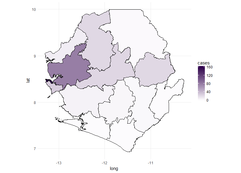
We can now use the new ebola_data data frame to plot the number of cases for each
area in Sierra Leone. We start by plotting the cases for a single week using ggplot
(see ggplot tutorial for an introduction on how to use ggplot2) it’s important to include
the group=group argument to make sure that polygons are plotted in the correct order. By
including fill=cases geom_polygon will change the fill colour for each polygon depending on the
number of cases in each polygon. The scale_fill_gradient function allows us to change the low and
high fill colours. http://colorbrewer2.org is a good place to source colour schemes for maps.
## Subset the ebola data to plot just one week
ebola_data_sub <- ebola_data[ebola_data$date.y=="X.2014.W51.",]

## create ggplot object ##
ebola_plot_sub <- ggplot(data = ebola_data_sub, aes(x = long, y = lat, group=group)) +
  geom_polygon(aes(fill = cases),color="black") +
  scale_fill_gradient(low = "#fcfbfd", high = "#2d004b") +
  coord_map() + theme_minimal()

## Plot ggplot object

ebola_plot_sub
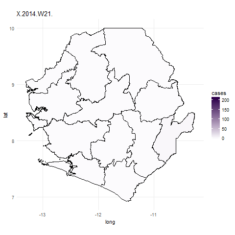
We can now use the gganimate package to plot the data for all weeks. To do this
we use similar code for the ggplot function but simply add in the frame=date.y argument.
In the ebola_data data frame date.y is the variable that contains information about the week case numbers
were collected for. The gganimate function will then create a plot for each week and combine these to create a gif.
We use the first argument to tell gganimate the ggplot object we want to gganimate
and the filename= argument to designate a filename for a file to be written out into the working directory.
It might take a little while to do this.
## Plot data for the whole outbreak using gganimate() ##
ebola_plot_animate <- ggplot(data = ebola_data, aes(x = long, y = lat, group=group, frame=date.y)) +
  geom_polygon(aes(fill = cases),color="black") +
  scale_fill_gradient(low = "#fcfbfd", high = "#2d004b") +
  coord_map() +
  theme_minimal()

## animate plot with gganimate
gganimate(ebola_plot_animate, filename="ebola_gif.gif")
2. Visualising crime data using ggmap
The next part of the tutorial will focus on using the ggmap and ggplot packages to visualise crime data in Greater Manchester. First of all we will load all of the required packages. If you don’t already have these packages then you will need to install them. We will also set our working directory.
library(ggplot2)
library(ggmap)

setwd(Your_working_directory)
We will start my importing the crime.csv file into R using the read.csv function.
We will then subset this data based on the crime that we want to plot a heatmap for.
Using the unique function allows us to view all of the crime types in our dataframe.
In this case we will focus on bicycle theft.
c_data <- read.csv("Crime_data.csv", header=T) ## Read csv file with crime data

unique(c_data$Crime.type) ## list different types of crimes in dataset

c_data_b <- c_data[c_data$Crime.type=="Bicycle theft",]
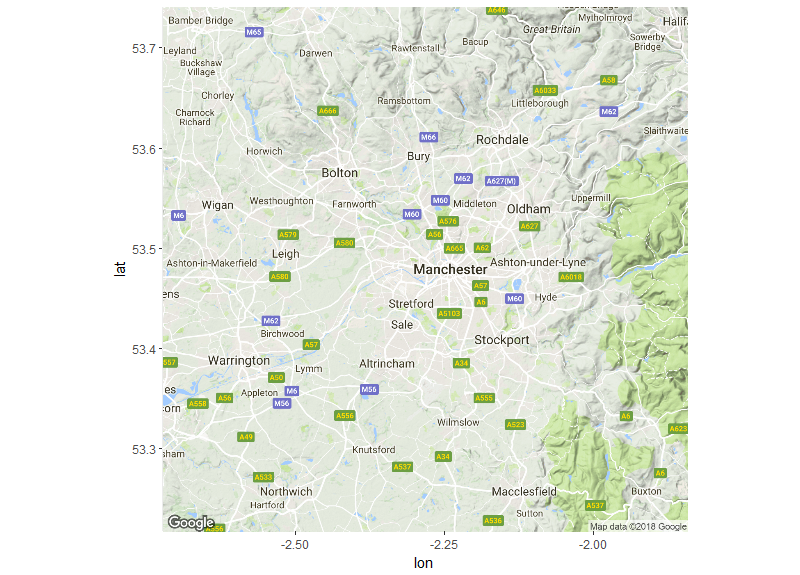
Then we will get the base map of the area we want to focus on by using the
get_googlemap function. This function allows you to download a map from the
google maps API. The lat= and long= arguments will be the centre of the map
that you will download and the extent of this map can be controlled using the
zoom= argument. By using the mean of our latitude and longitude we are able to
identify the centre of the area we want to download. You can then plot the map
to check it and adjust zoom accordingly. The type of map that you want to
download is selected using the maptype= argument. In this case we will
download a “terrain” map although there other options (“satellite” and
“roadmap”). You can further customise the google maps you download by using the
style= argument, this argument passes HTML code to the google API to
customise the map you download. For example, if we include
style='feature:all|element:labels|visibility:off it will remove all of the text
from the map. https://developers.google.com/maps/documentation/static-maps/ has some good examples of ways to customise maps from google. We can use the function ggmap to
plot the map.
map <- get_googlemap(c(lon=mean(c_data_b$Longitude), lat=mean(c_data_b$Latitude)), zoom=10,maptype="terrain")

ggmap(map)

map_no_text <- get_googlemap(c(lon=mean(c_data_b$Longitude), lat=mean(c_data_b$Latitude)), zoom=10,maptype="terrain",style="feature:all|element:labels|visibility:off")

ggmap(map_no_text)
For this visualisation we are going to plot the density of points using the
stat_density2d function. This function utilises the kde2d function to calculate
contours and create a heatmap. The kde2d function determines the
density of points within a given bandwidth or search radius. Kde2d will
calculate a bandwidth automatically but this bandwidth can also be defined
manually if you are interested in including a specific bandwidth, perhaps to use
a finer resolution to calculate the desnity of points. Before defining
this bandwidth we need calculate interval of latitude and longitude that covers
200m in our area. The function below allows us to calculate which interval of
latitude x_d and longitude y_d is the equivalent of 200 meters. We can use
this later to define our bandwidth.
# Calculates the geodesic distance between two points specified by radian latitude/longitude using the
# Haversine formula (hf)
gcd.hf <- function(long1, lat1, long2, lat2) {
  R <- 6371 # Earth mean radius [km]
  delta.long <- (long2 - long1)
  delta.lat <- (lat2 - lat1)
  a <- sin(delta.lat/2)^2 + cos(lat1) * cos(lat2) * sin(delta.long/2)^2
  c <- 2 * asin(min(1,sqrt(a)))
  d = R * c
  return(d) # Distance in km
}

metric <- 200 ## bandwidth in meters
#X
x_d <- 0.1/(gcd.hf(-2.6,53.4,-2.5,53.4)/metric) ## calculate distance in lon
x_d

#y
y_d <- 0.1/(gcd.hf(-2.6,53.4,-2.6,53.5)/metric) ## calculate distance in lat
y_d
Now we can plot our crime data on the base map using ggplot and ggmap.
The ggmap() function will plot your base map and we can then use other ggplot
functions to plot in layers on top of this base map. First we will use geom_point
to plot the locations where bikes were stolen in Manchester. At this point we
can also refine the extent of our base map further by using scale_x_continuous
and scale_y_continuous. By using the min and max of latitude and longitude we can
change the extent and zoom in on the range of our coordinates. We can also use
the expand= argument to create buffer around the edge of the spatial range of
our points so they aren’t too close to the edge of the plot.
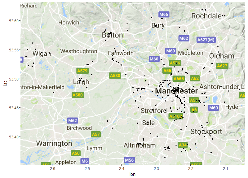
raw_points <- ggmap(map) + geom_point(data=c_data_b,aes(x=Longitude,y=Latitude),size=1)+
  scale_x_continuous( limits = c(min(c_data_b$Longitude),max(c_data_b$Longitude)) , expand = c(0.01 , 0.01) )+
  scale_y_continuous( limits = c(min(c_data_b$Latitude),max(c_data_b$Latitude)) , expand = c(0.01, 0.01))

raw_points
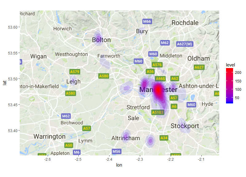
Finally we will add stat_density2d to create a heatmap of the density of these
points. The stat_density2d function will accept the same aesthetic arguments as most ggplot
functions and you can also include arguments that are specific to the kde2d function.
In this case we include an argument to pass to the kde2d function, which is h=.
This is the argument to define a bandwidth, if this argument is left out stat_density2d
will calculate the bandwidth automatically. In this case we will tell the kde2d
function that we want it to use a bandwidth of x_d and y_d, the equivalent of 200m.
The arguments with ..level.. will vary the fill and transparency based on the
density of points derived using the kde2d function. The higher the density estimate
the less transparent the contours will be. As before we use the scale_fill_gradient
function to define our low and high colours. The scale_alpha(guide=FALSE) will
remove the legend showing changes in alpha. For a more in depth desription of density maps see Section 5 in the
Quantifying Population and Visualising Species Occurrence Change Tutorial
Bike_dens_200m<- ggmap(map) + stat_density2d(data = c_data_b,aes(x = Longitude, y = Latitude,fill = ..level.., alpha = ..level..), geom = "polygon", h=c(x_d,y_d))+
  scale_fill_gradient(low = "blue", high = "red") + scale_alpha(guide = FALSE)+
  scale_x_continuous( limits = c(min(c_data_b$Longitude),max(c_data_b$Longitude)) , expand = c(0.01 , 0.01) )+
  scale_y_continuous( limits = c(min(c_data_b$Latitude),max(c_data_b$Latitude)) , expand = c(0.01, 0.01))

Bike_dens_200m